Author Archives: kate

AWS Location Service basemaps

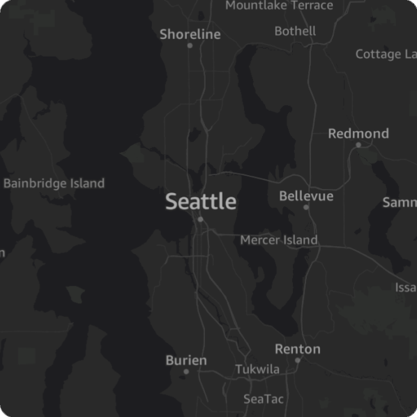
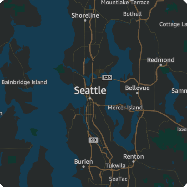
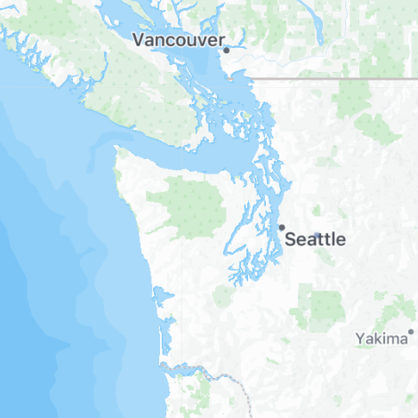
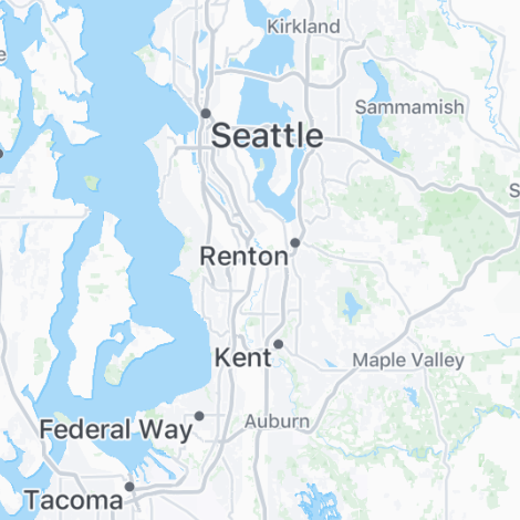
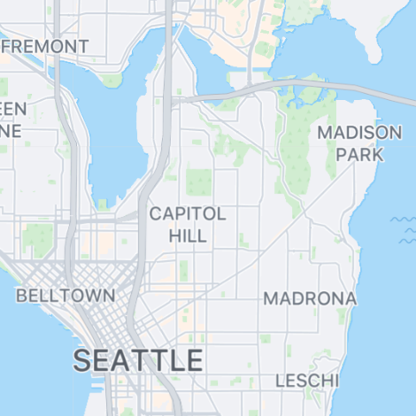
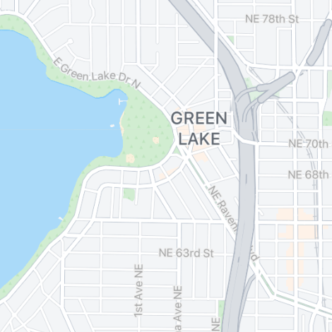
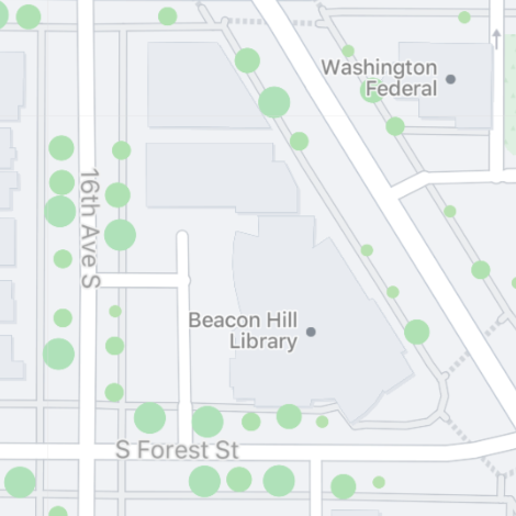
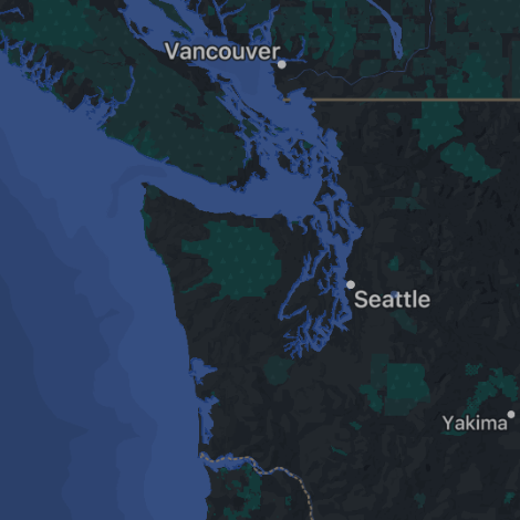
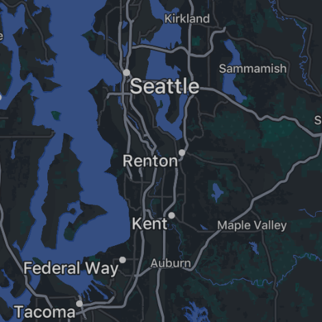
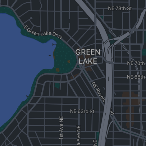
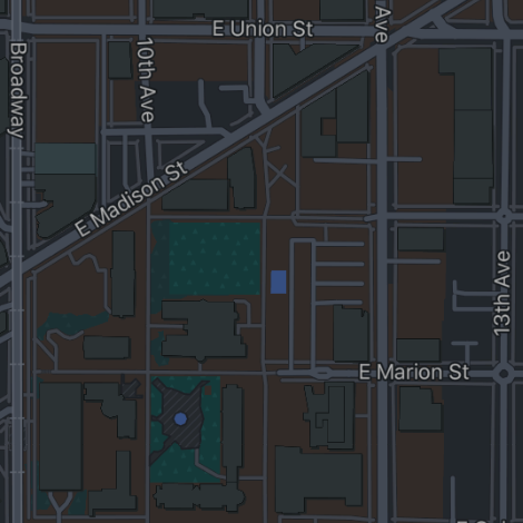
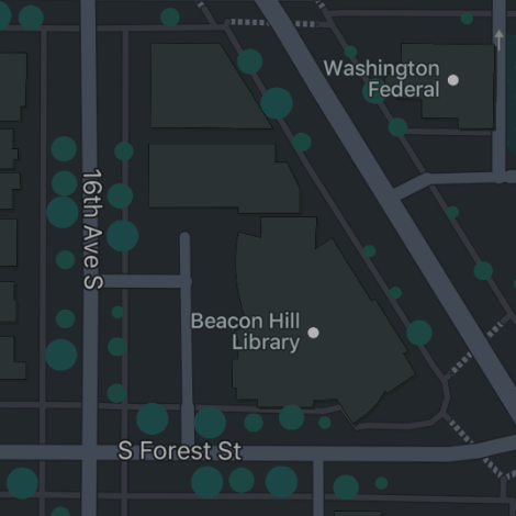
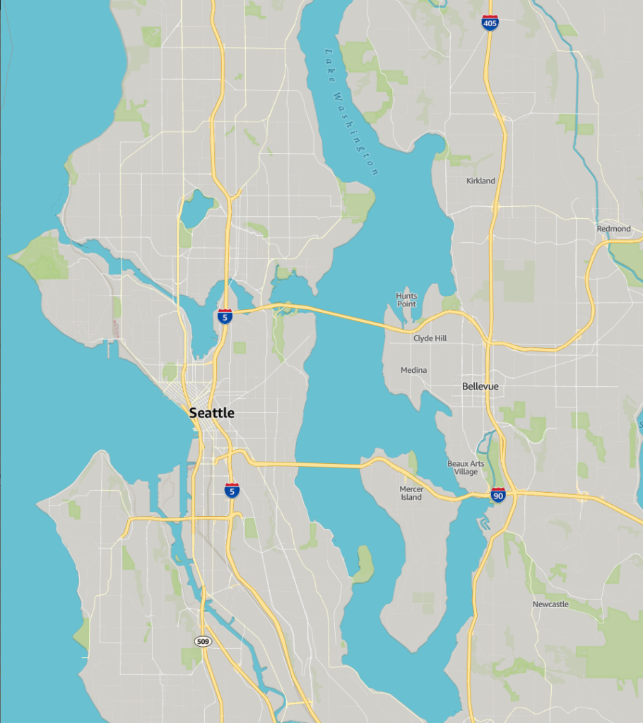
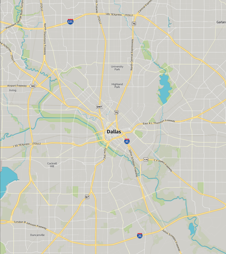
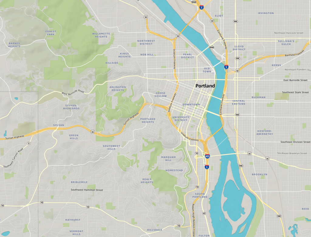
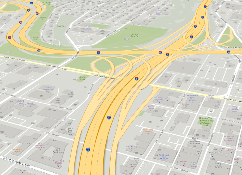
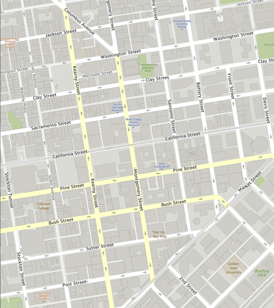
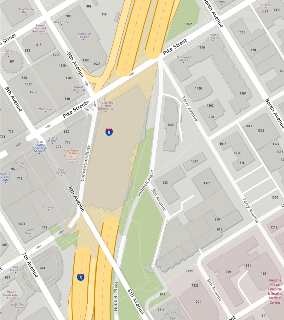
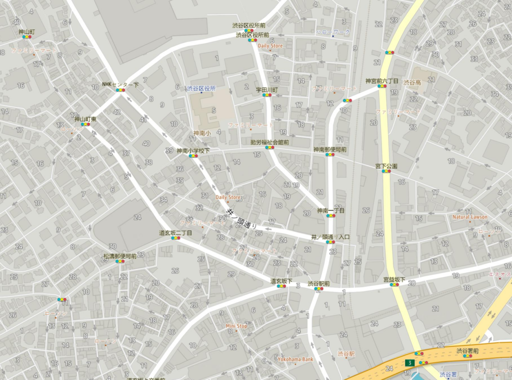
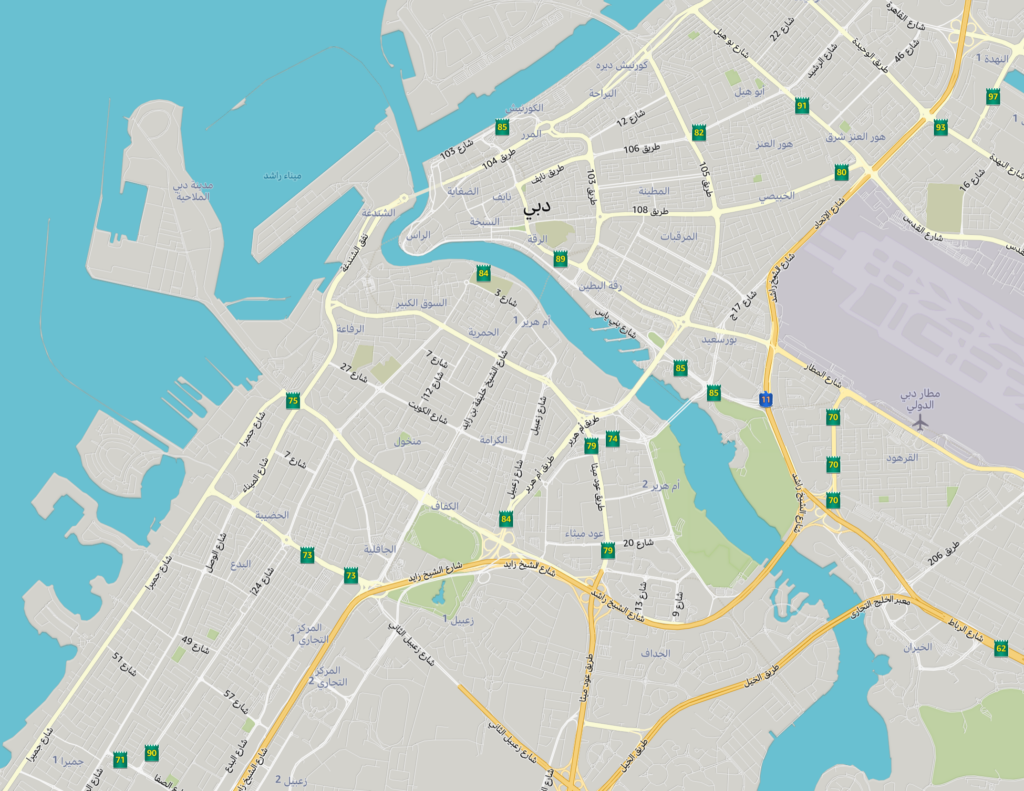
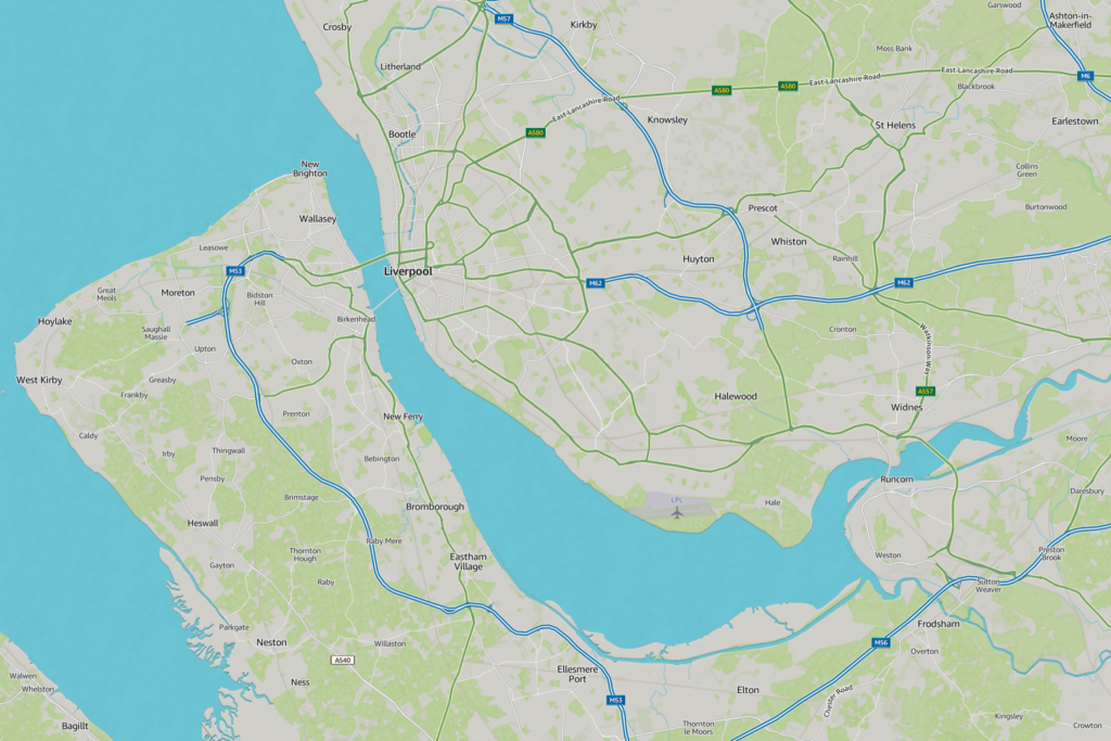
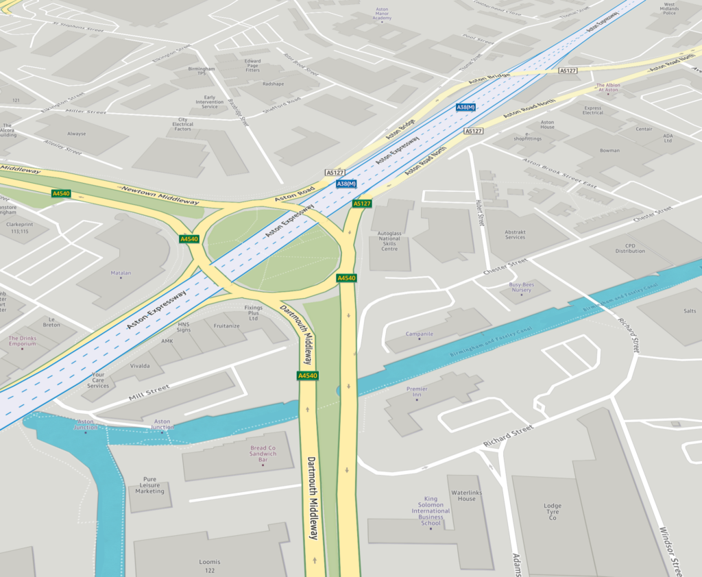
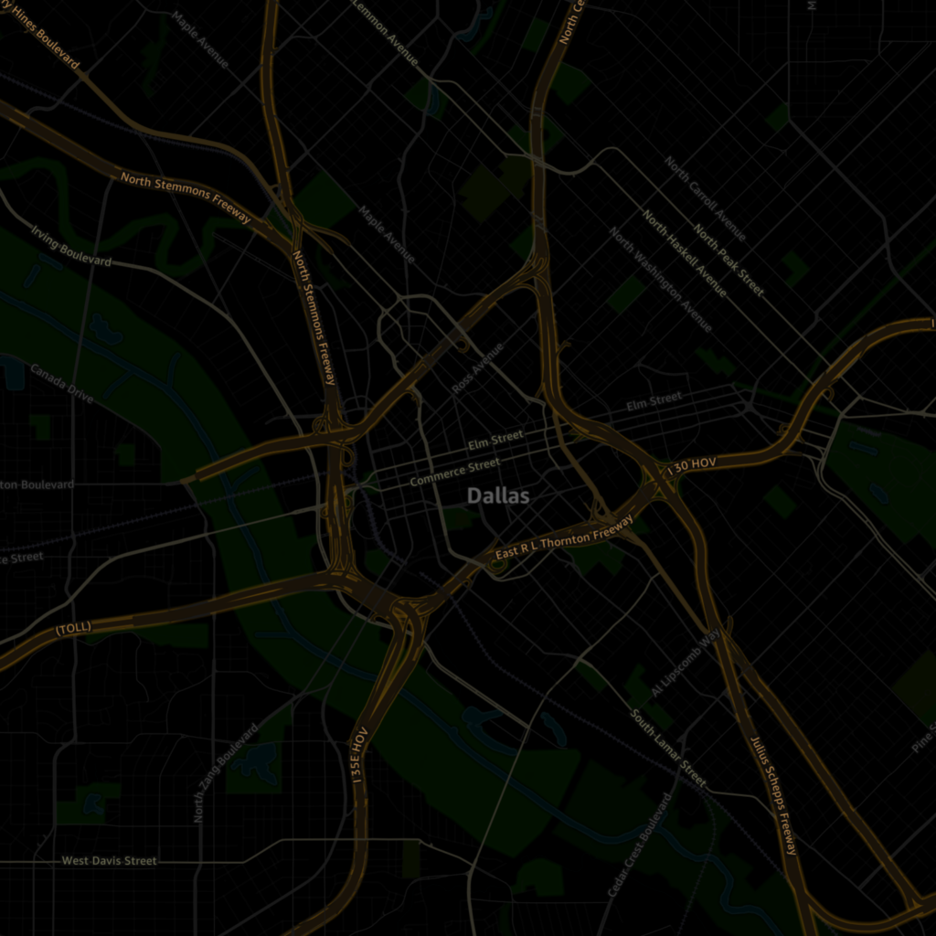
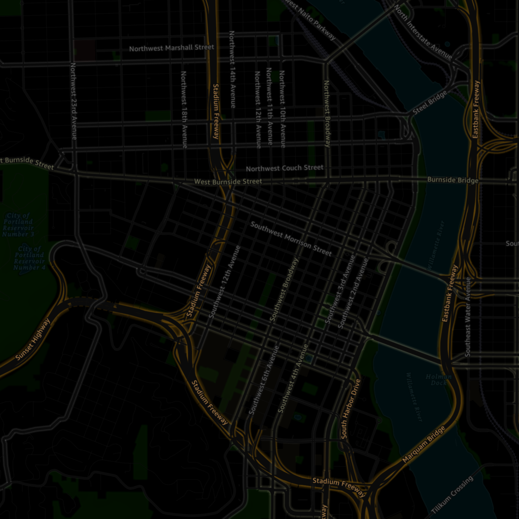
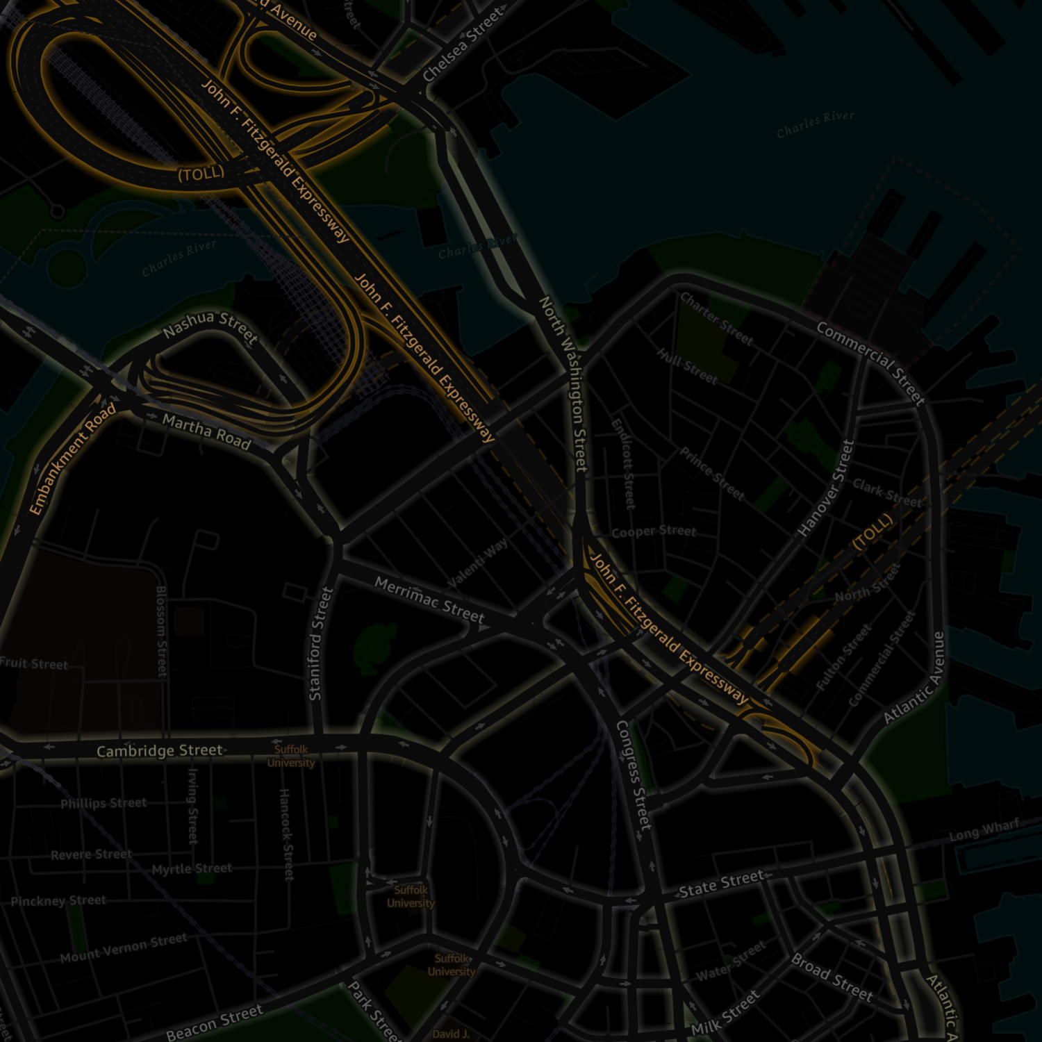
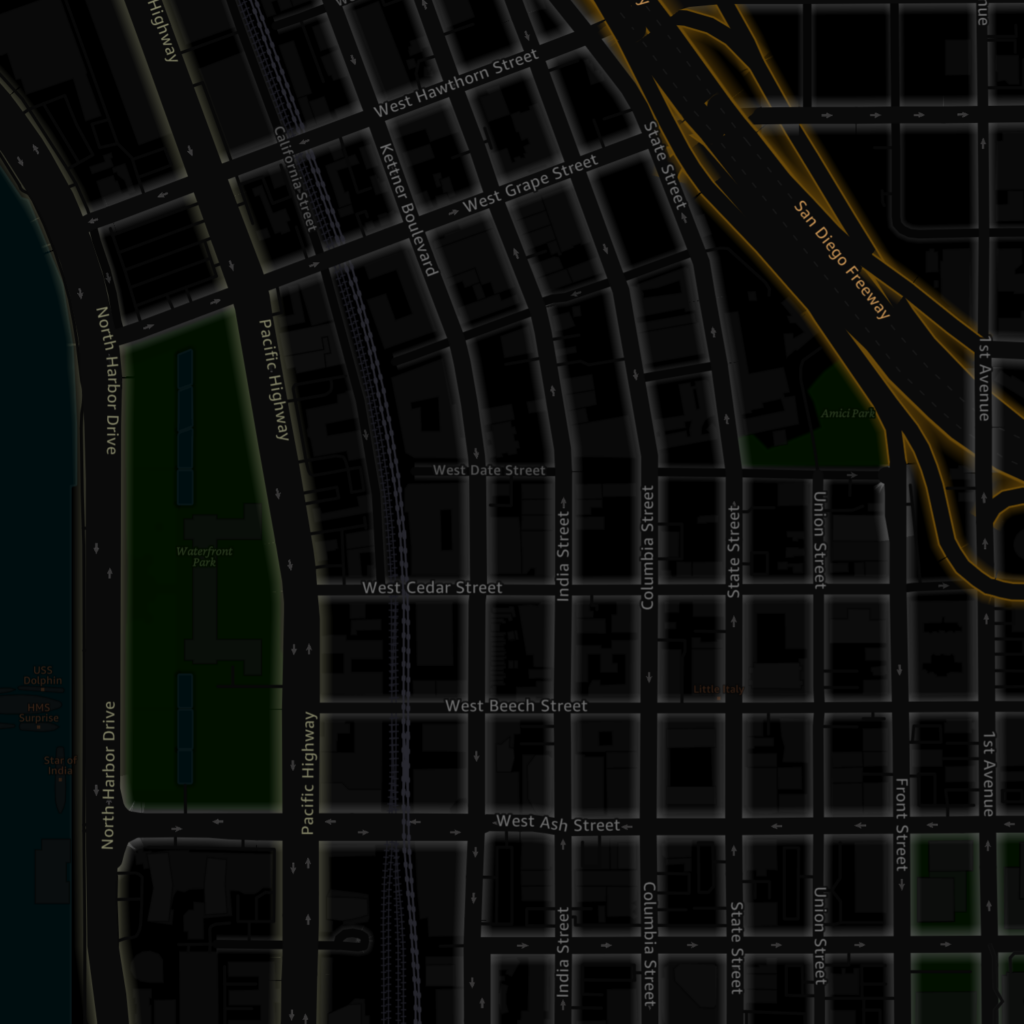
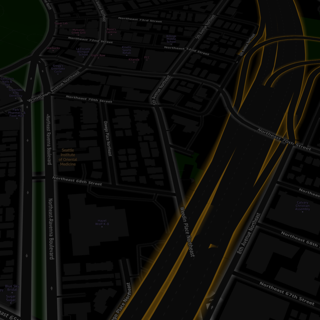
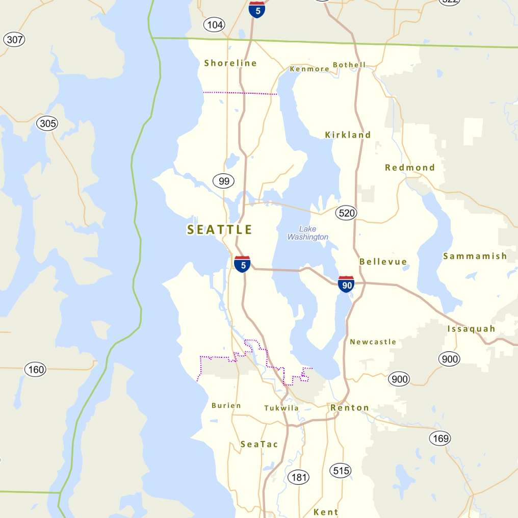
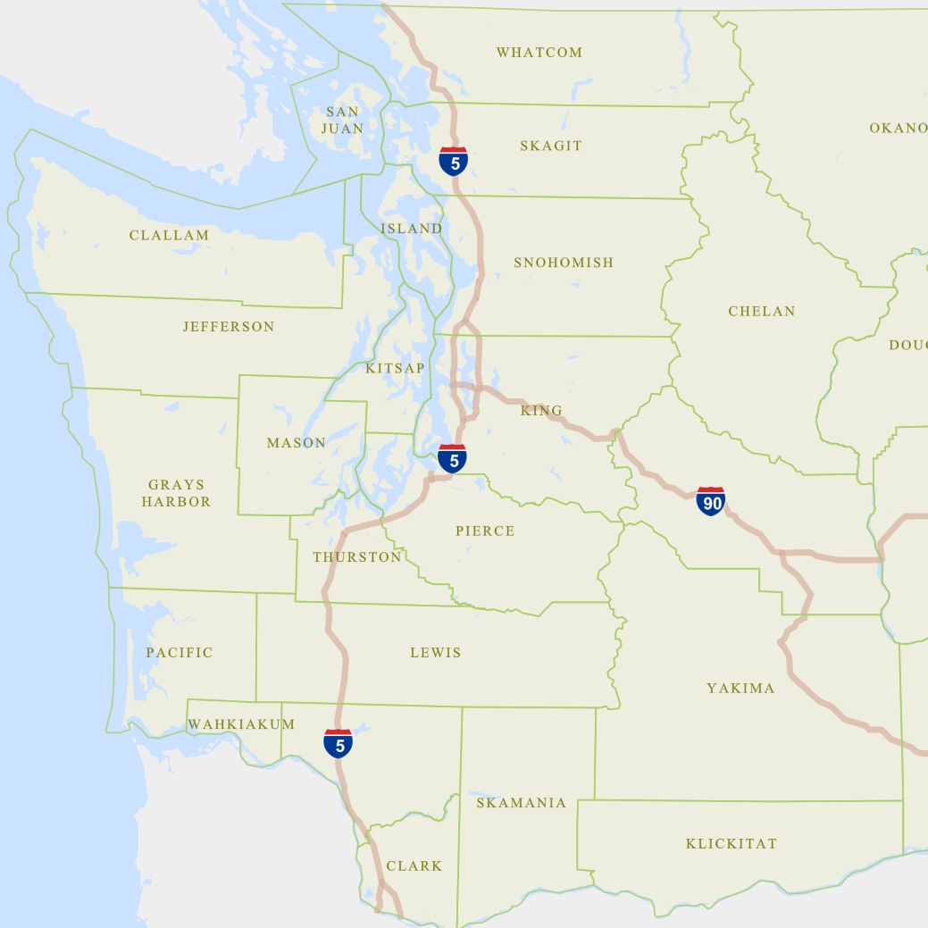
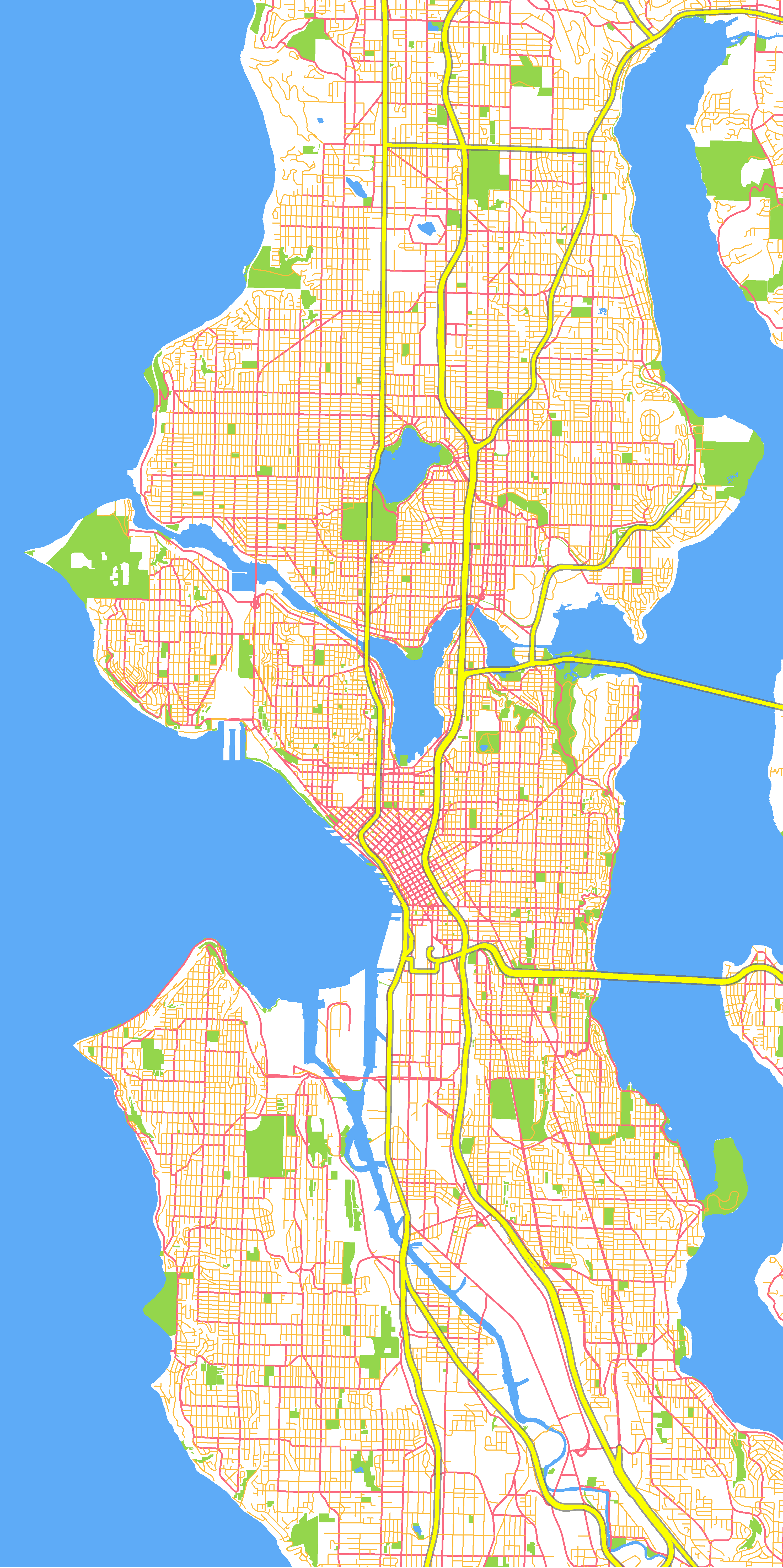
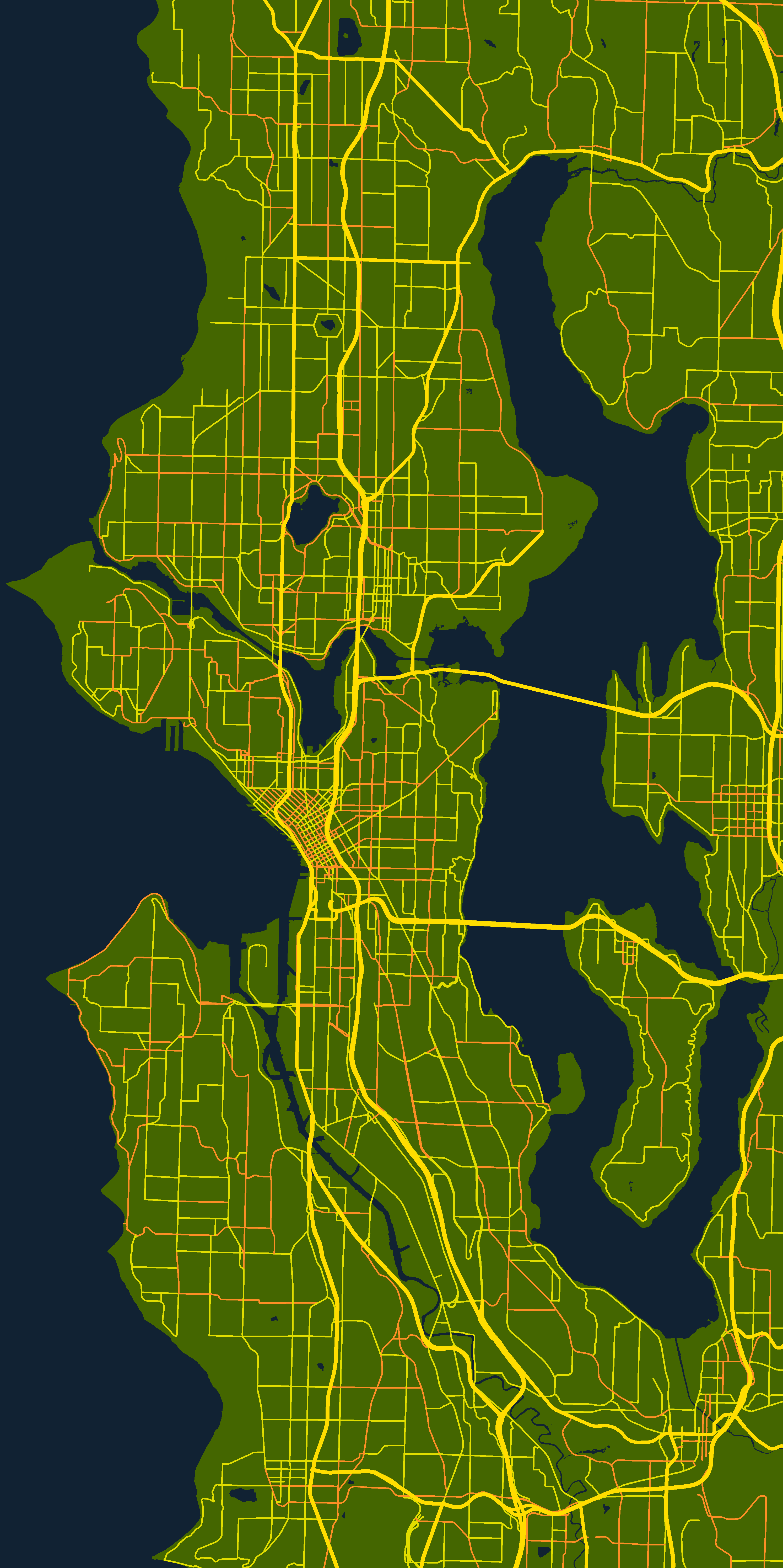
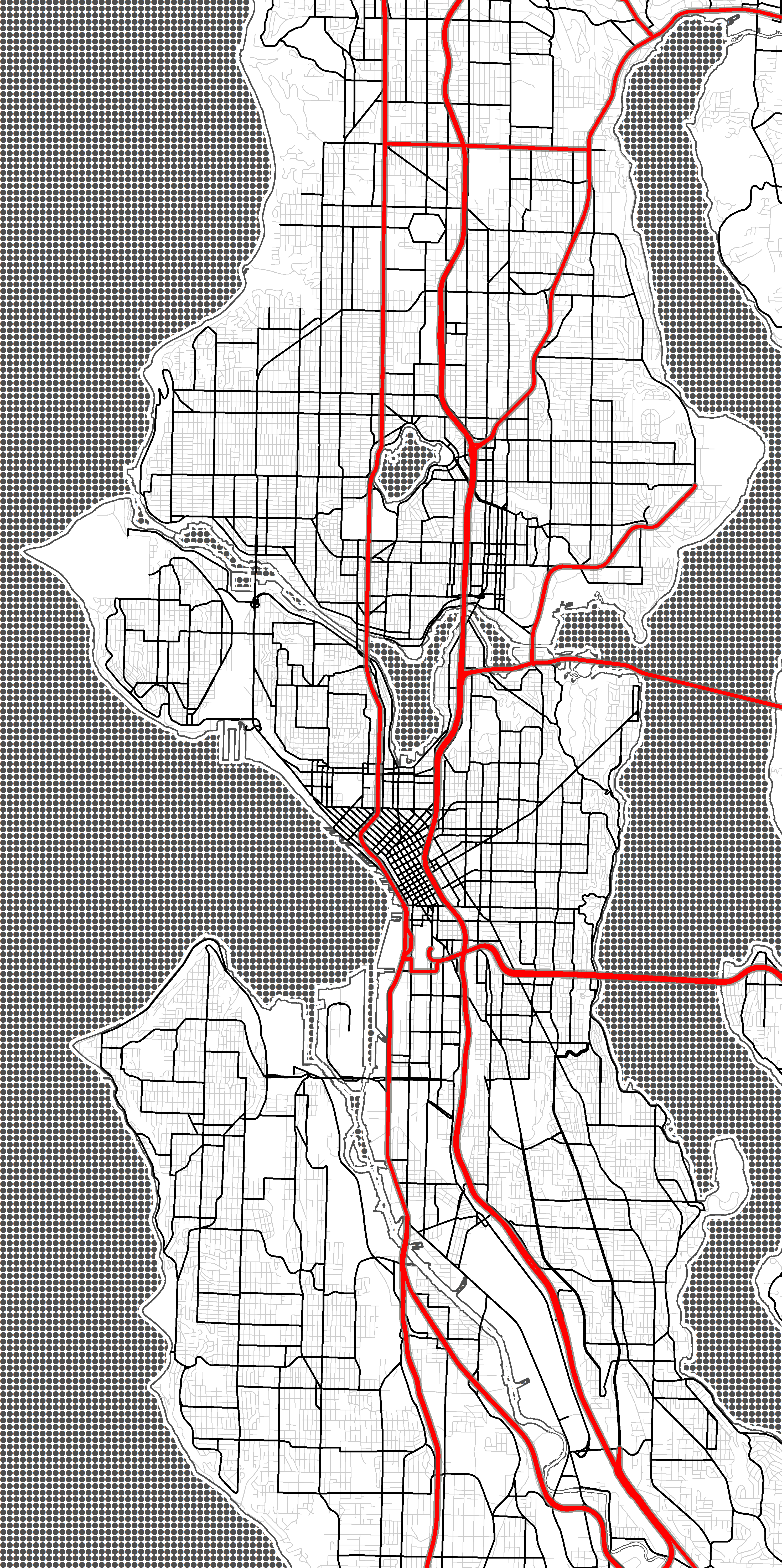
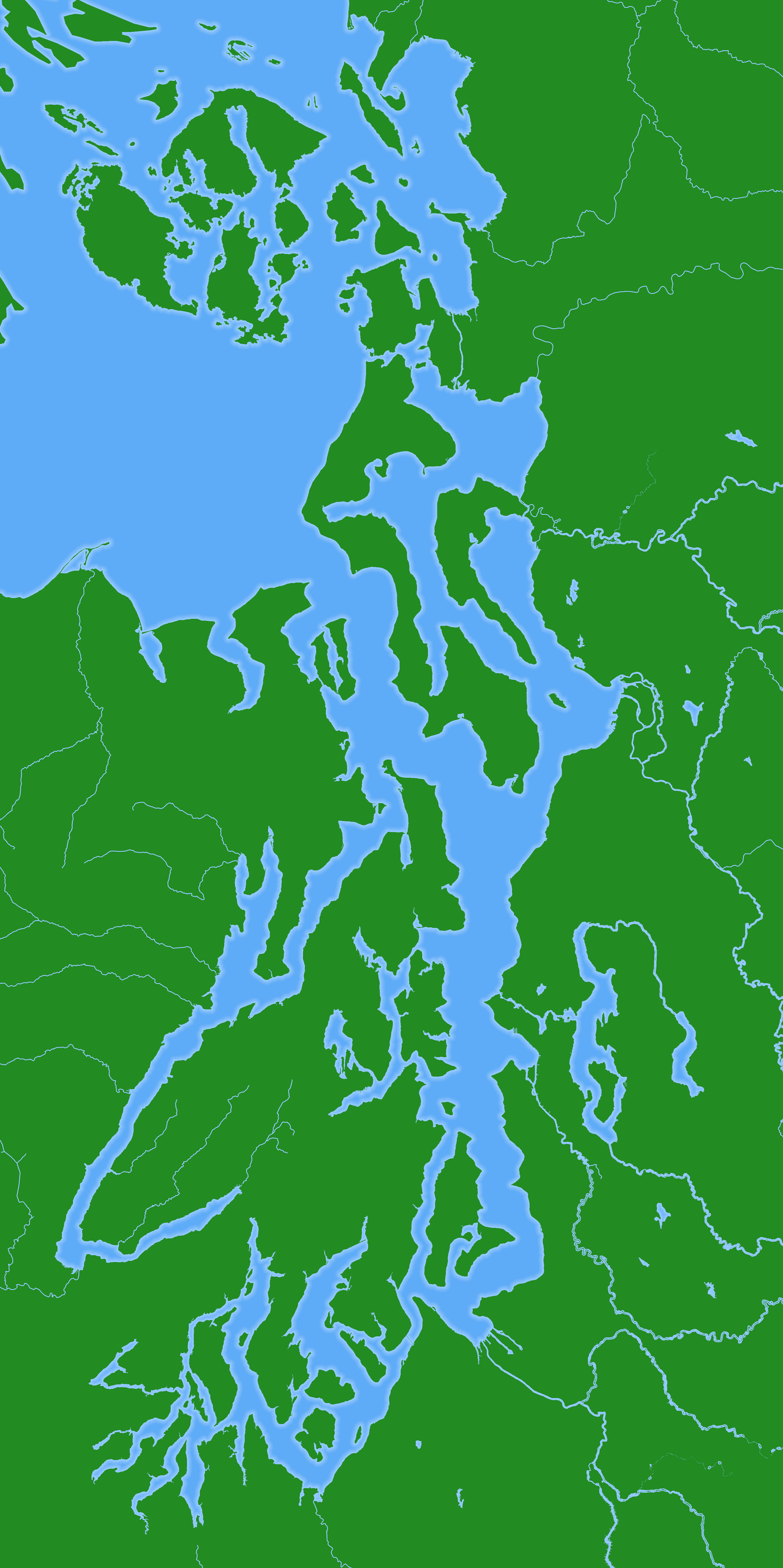
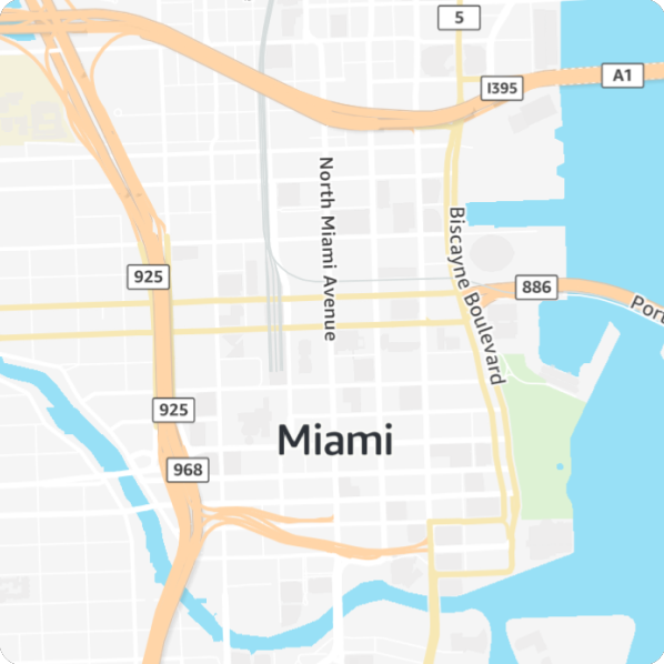
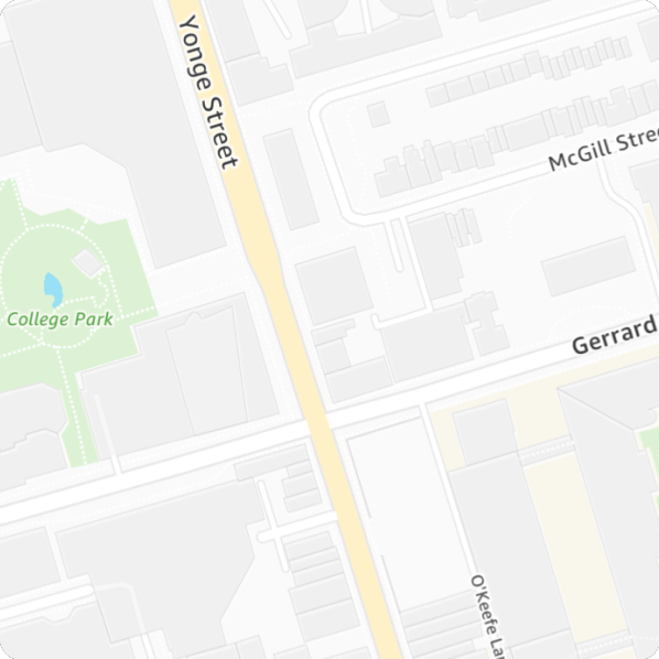
Through Stamen Design, I worked with another cartographer to design new map styles to accompany the launch of new vector map data tiles created by AWS Location Service. We created and refined four basemaps:

  • Light reference (muted colors)
  • Dark reference (muted colors)
  • Light data visualization (greys)
  • Dark data visualization (greys)

The main style, light reference, launched as part of the service’s preview in late 2022.

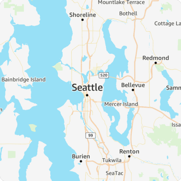
The other three styles launched when the service reached General Availability in March 2023.

Talk: Cartographers in video games

When I tell adults I’m a cartographer, about 80% of the time I get a blank stare in response. It’s a fun treat when I find someone who already knows the term.

This may change with the next generation, because in video games a cartographer is a relatively common character. Today’s teenagers are growing up more familiar with the idea that a cartographer makes maps. But when they think of a cartographer based on their video game experiences, what do they see? I decided to find out. I shared my findings at NACIS 2022 in Minneapolis.

I want to be a cartographer when I grow up!

Cartographers often appear in video games, helping players gain new pieces of the world map. What are these representations teaching kids (and adults) about who cartographers are? In this talk I’ll share my analysis of the ways cartographers are represented in popular video games.

Meta basemaps

Through Stamen Design, I worked on a small cartographic team that improved, maintained, and added new features to the vector tile basemap used throughout Facebook and Instagram.

In addition to visual improvements, I conducted a thorough reorganization of the vast number of build files used to generate the vector data tiles and map stylesheets. This made the cartographic system simpler and easier to use, less redundant, and more consistent. I also wrote the first version of the layers documentation for Meta’s Earth Table database.

Map projection trading card

In early 2022, Daniel Huffman put out a call for participation for a fun project to create trading cards for map projections, and I signed up. I chose to portray the Mollweide projection because it was the first projection I deliberately chose for a map, back in my first cartography class.

The Projection Collection trading cards were released in fall 2022 and trading them was a big hit at the NACIS conference. I managed to collect almost all of them (if you have #6 or #39, please reach out to me).

Circuit board map

I was asked to create a panel for the NACIS 2021 map quilt, and assigned a section of Oklahoma City. I’d recently been tinkering with Arduino circuitry, so my grid-like suburban corner of OKC immediately reminded me of a circuit board. I also wanted to highlight Oklahoma City’s tech industry and significant role in the growing Silicon Prairie.

On my map quilt square, buildings from OpenStreetMap became components, classified by size. I made the smallest buildings connector holes and lumps of solder. Medium-sized buildings became common components like capacitors and resistors, and the largest buildings became unique components like a speaker and inductor. To get the component images, I found 3D models of each so I could capture the perfect overhead angle.

circuit board map

Here’s my square as part of the whole quilt, showcasing the work of several excellent cartographers.

Talk: Explaining cartography’s complexity

During my time at Amazon, I found myself answering questions and dispelling assumptions about cartography on a regular basis. Eventually, I developed a 15-minute talk on the subject and gave it many times to engineers, designers, and managers. I also shared it at NACIS 2021 in Oklahoma City.

“Can’t You Just…”

As the only cartographer at my company, I often need to explain to colleagues what I do and why cartography is more complicated than they assume. I’ve developed an example-packed talk that teaches non-cartographers to better understand cartographic decision-making, including necessary trade-offs and the logical framework behind seemingly simple style choices. My NACIS talk will help cartographers better explain this complexity to others and challenge the assumptions behind questions that begin, “Can’t you just….”

GIS Day 2022

I also gave this talk to Colorado State University GIS students for GIS Day 2022, and this recording is a little cleaner, with just my slides and audio.

Delivery driver basemap

At Amazon, I completely redesigned the flagship map style for the Last Mile organization using stakeholder-requested style conventions with color and brightness choices honed by user testing.

As Last Mile expanded operations throughout the world, I internationalized the map style to accommodate needs like different languages, OSM tagging conventions, and data providers/schemas.

The primary users of the map style were Amazon delivery drivers. The style was also in use by dozens of other products across Amazon, both internal- and external-facing.

3D terrain map & demo

3D-printed map

I participated in How to do Map Stuff, a virtual cartography workshop, and gave a live demo of the process to create this 3D-printed terrain map.

3D map resources

Low-light basemap

Driving at night with a bright map designed for daytime use is blinding and dangerous. On my own initiative, I did extensive research on human vision and color perception, and wrote a successful case for a project to develop a dark map.

I designed this map style while literally sitting in the dark, first in a cardboard “fort” I constructed around my cubicle, then in a blacked-out room in my house during the pandemic.

The innovative glowing design I created allowed me to use the same road colors as the light/daytime map while keeping the overall brightness to the appropriate level.

NOTE: unless you’re in a dark place, these maps will probably look too dark.

Stained glass map

I was asked to create a panel for the NACIS 2019 map quilt, and assigned a section of the Tacoma area. In honor of Tacoma’s Museum of Glass and the conference venue Hotel Murano, I created a digital map that looks like stained glass. Its textures come from photos I took of real stained glass.

Here it is, as part of the entire quilt:

Talk: Analysis of online print services

I ordered a copy of the same cartographic image from 14 different online print services and compared the results. In my talk at the annual NACIS conference in Tacoma, I revealed the customer experience and print quality of each.

Someday My Prints Will Come: Comparison of Online Print Services

You’ve designed a map and want a to print a small run to sell or distribute. There are many online companies clamoring for your business, but their services vary widely in areas like pricing, available sizes, texture, customer experience, and quality. How do you know where to order and what to expect? To answer this question, I ordered prints of the same cartographic image from over a dozen online printers. In my talk, I’ll share the resulting prints and what I learned.

Talk: What to know about printing maps

In October 2018, I gave this presentation at the annual NACIS conference in Norfolk, VA. I designed and gave the talk, and the printing expert who provided the content (and a video cameo) was my late and greatly missed colleague Bruce Daniel.

Imprimatur: Printing Maps in Today’s Digital World

If you want to print a map, what do you need to know about printing terminology and methods? How much will it cost? What should you expect when working with a print company? How can you prepare your files to avoid costly corrections? Ultimately, how do you ensure that your map shines even more on paper than it does on the screen?

Talk: Getting the most out of a conference

I gave this talk, about how to create a presentation about a conference, in October 2018 at the annual NACIS (North American Cartographic Information Society) conference in Norfolk, VA. While it’s focused on the NACIS conference, the guidelines are applicable to any conference.

Be a Cartography Expert in Three Easy Steps 

1. Attend the NACIS conference.

2. Follow Kate’s tips and guidelines on what to record about the conference while you’re here.

3. Dazzle your local colleagues and geo community with a presentation about the highlights of the conference.

We all know NACIS is overflowing with fascinating cartographic content. You can show off presenters’ research, creativity, and eye-catching maps to raise your own profile back home, while promoting NACIS and the cartographers whose work you highlight. Kate will equip you to be a cartography maven by sharing what she’s learned from three years of giving presentations about the NACIS conference.

Vector tile basemap

As soon as Esri released vector tiles, I taught myself how to create, publish, and manually style them. I then created a vector tile version of the raster basemap I maintained for the City.

At the 2017 Washington GIS Conference (URISA), I gave two presentations about what I learned: one on how to style existing vector tile maps, and one on how to create a vector tile map in the Esri platform.

I gave the latter presentation again in October 2017 at the annual NACIS (North American Cartographic Information Society) conference in Montreal.

The Journey from Raster to Vector Basemaps with ArcGIS 

Esri customers are watching companies like Mapbox dazzle the cartographic world with vector tile mapping and wondering when the benefits of vector tiles will be within reach. Now they are! In late 2016, Esri removed the “beta” label from their vector tiles, and vector tiles can now be authored by anyone with ArcGIS Pro and published to ArcGIS Online. Vector tiles offer enormous promise: high-resolution graphics, client-side rendering, significantly smaller storage and bandwidth needs, and the ability to apply multiple styles to a single tileset. With all these benefits, what do you need to know before taking steps to leave your raster basemaps behind? I recently developed a vector tile basemap for the City of Seattle, and I’ll share what I learned, good and bad. Topics include: paradigm shifts in basemap organization; technical details; best practices; workflow; advice on working efficiently; and lots of tips, tricks, bugs, and stumbling blocks.

Where I Stand Maps series

After the 2016 election, I started a project to raise money for vital non-profits by selling beautiful and striking map art decals for cell phones. I created six designs, each inspired by a different cause that was especially under attack. All proceeds from each design go to a non-profit working for that cause. I’m supporting:

I selected non-profit organizations that are fighting on a national level, to have the greatest effect. All of them have a rating higher than 90/100 on Charity Navigator, indicating low overhead, good financial management, and transparency (except Black Lives Matter, which doesn’t make enough income to be rated).

Virtual meeting rooms

As a NACIS board member at large, one of my contributions was organizing virtual events for the 2020 and 2021 conferences. We used the Remo platform with great success, and I enjoyed designing virtual meeting rooms to use each year’s brand colors and design elements.

Room layout using teal and orange with a teal hillshade image as the background
Room for the 2020 NACIS Night In (thanks to Tom Patterson for the background hillshade image)
Room layout in shades of brown with a fantasy map background
A fantasy map pub for casual events (thanks to K. M. Alexander for the fantasy map)
Room layout with small posterboards containing tiny map images
The 2021 student map gallery, using images of the actual map entries (background image from Tom Patterson)
Room for the 2021 NACIS Night In (background image from Tom Patterson)

Firefly style map

This fall, I attended my second NACIS (North American Cartographic Information Society) conference, which has become a highlight of my year. One talk I found particularly inspiring was John Nelson‘s presentation on Firefly Cartography. I could explain what that means, but an image makes it pretty clear.

A firefly map of U.S. military bases, by John Nelson

I was excited to make my own firefly map. At the same time, I was knee-deep in roads data for my employer, the City of Seattle, and had been wondering about the public staircases I noticed there. So I seized on that theme, and created this map in a few hours, using only ArcMap.

As John noted, glowing things have a white center surrounded by opaque color, then increasingly transparent color. I didn’t take the time to make perfect gradient icons in Illustrator; instead I just repeated the layer several times in ArcMap. The staircases are classified by length, so longer stairs are greener and brighter.

After I finished I was pleased with the look, but I wanted to take it a step further and make it really glow, not just look like it was glowing. So, I had it printed on glass!

It’s easier than you might think – you can order glass prints from Shutterfly (promo codes are usually available for a discount off the list price). Now my map truly glows.

Washington Poison Center map series

I created a series of 74 static maps for the Washington Poison Center to help them communicate the scope of their work to legislators, hospitals, and other stakeholders. I also created a near-real-time dashboard for their call center to help highlight unusual trends.

Static map examples:

Dashboard: