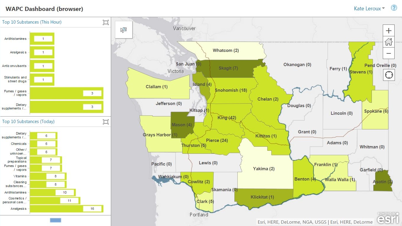
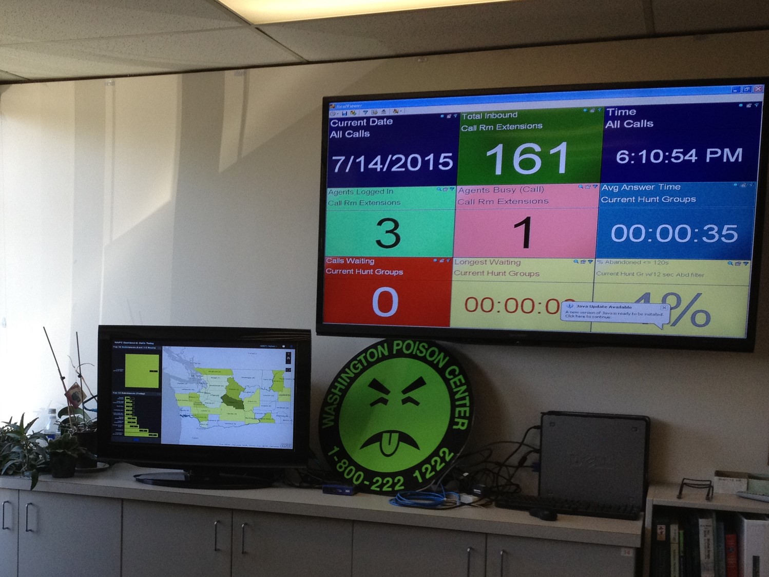
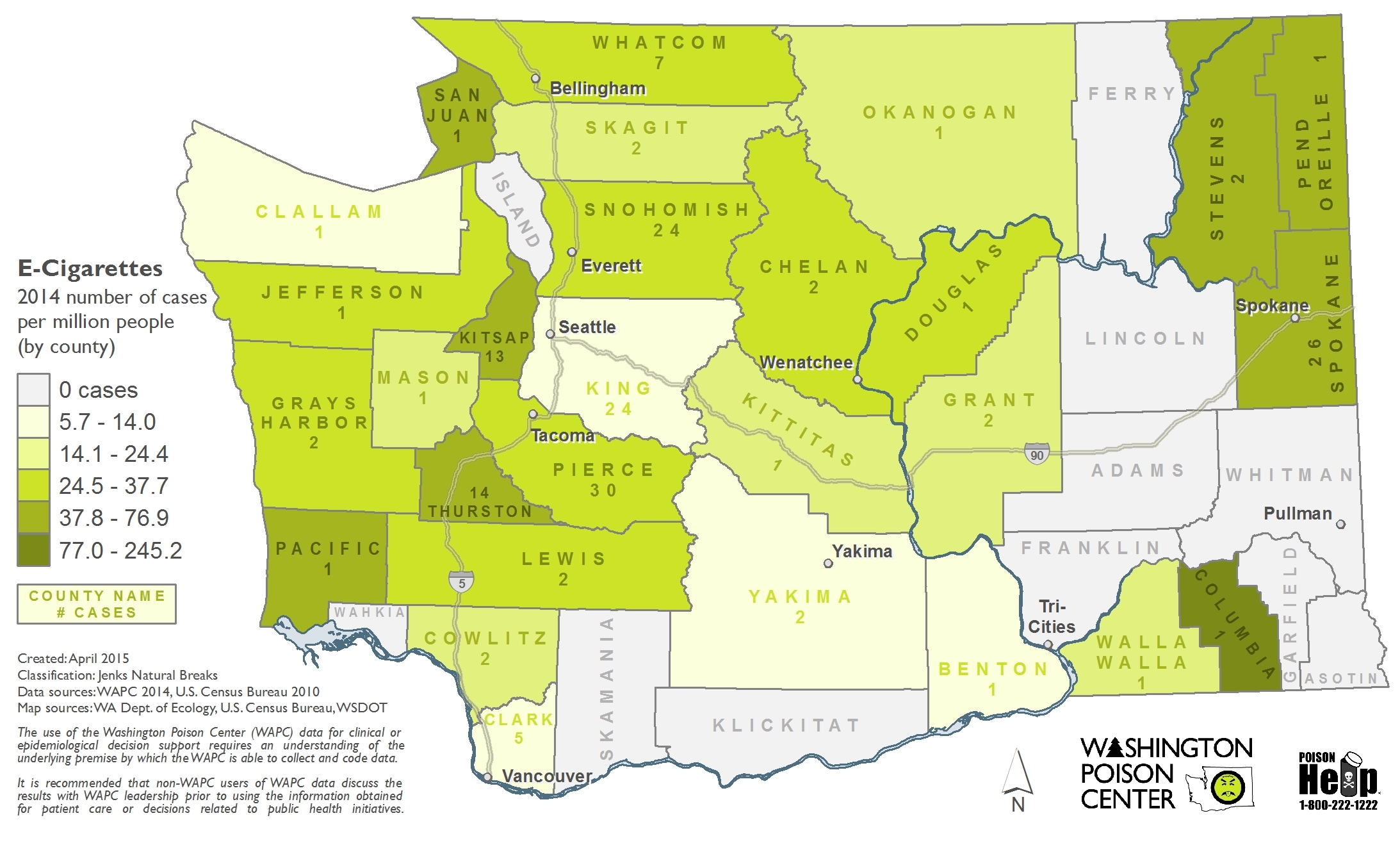
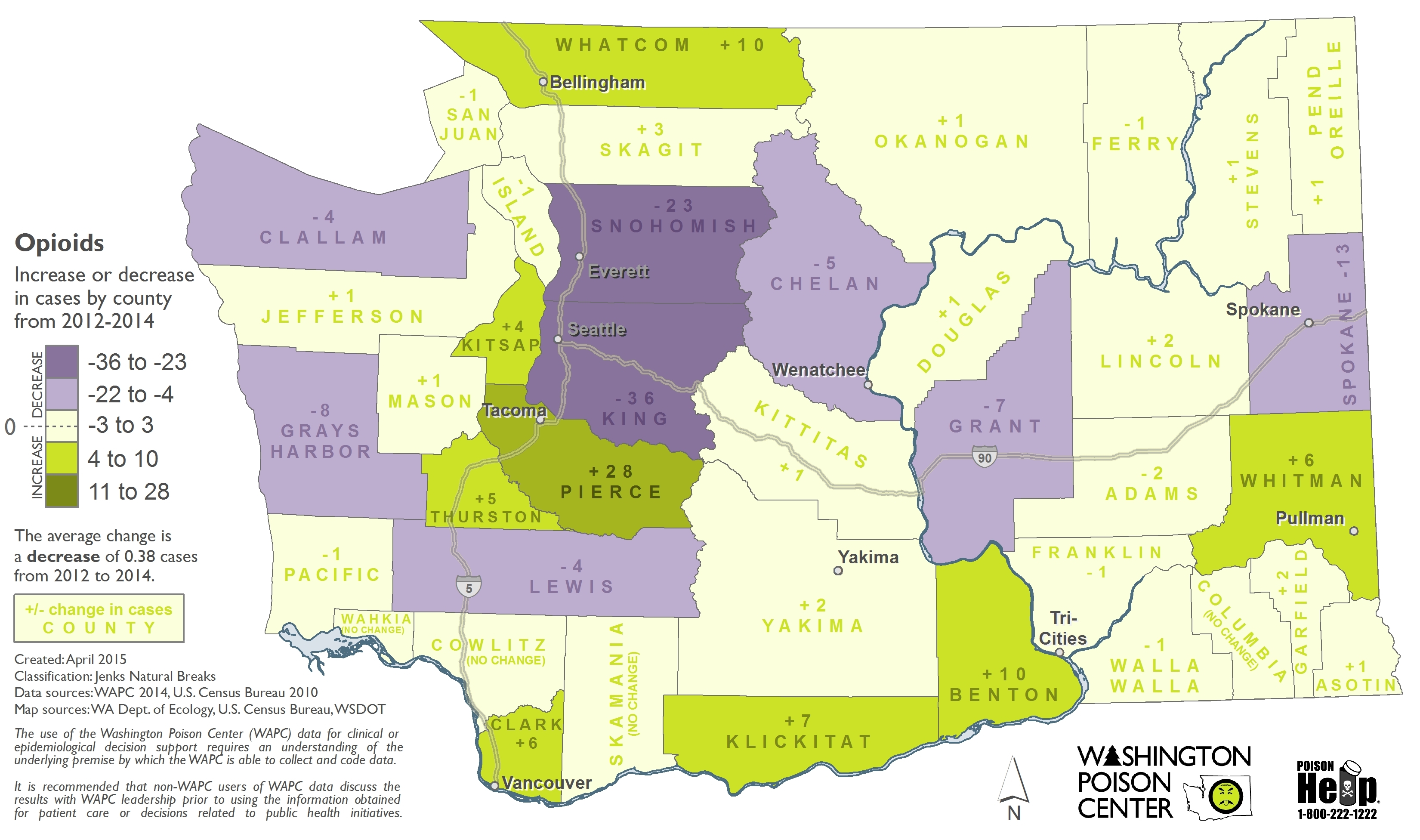
I created a series of 74 static maps for the Washington Poison Center to help them communicate the scope of their work to legislators, hospitals, and other stakeholders. I also created a near-real-time dashboard for their call center to help highlight unusual trends.
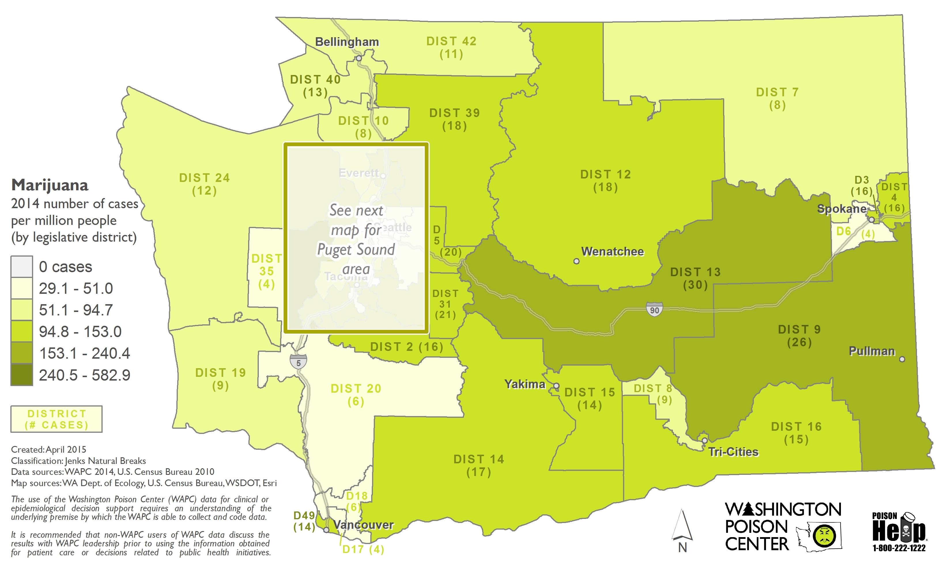
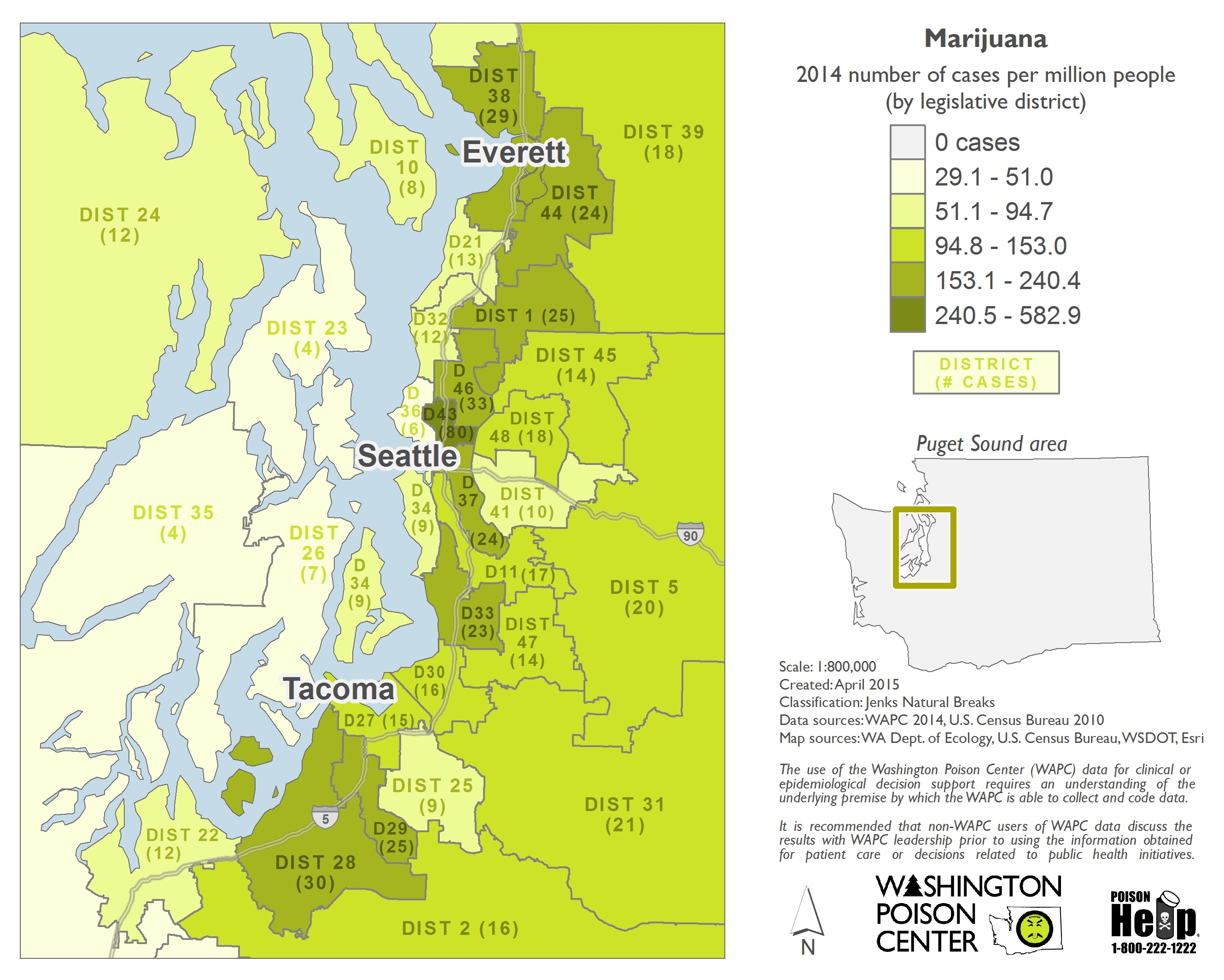
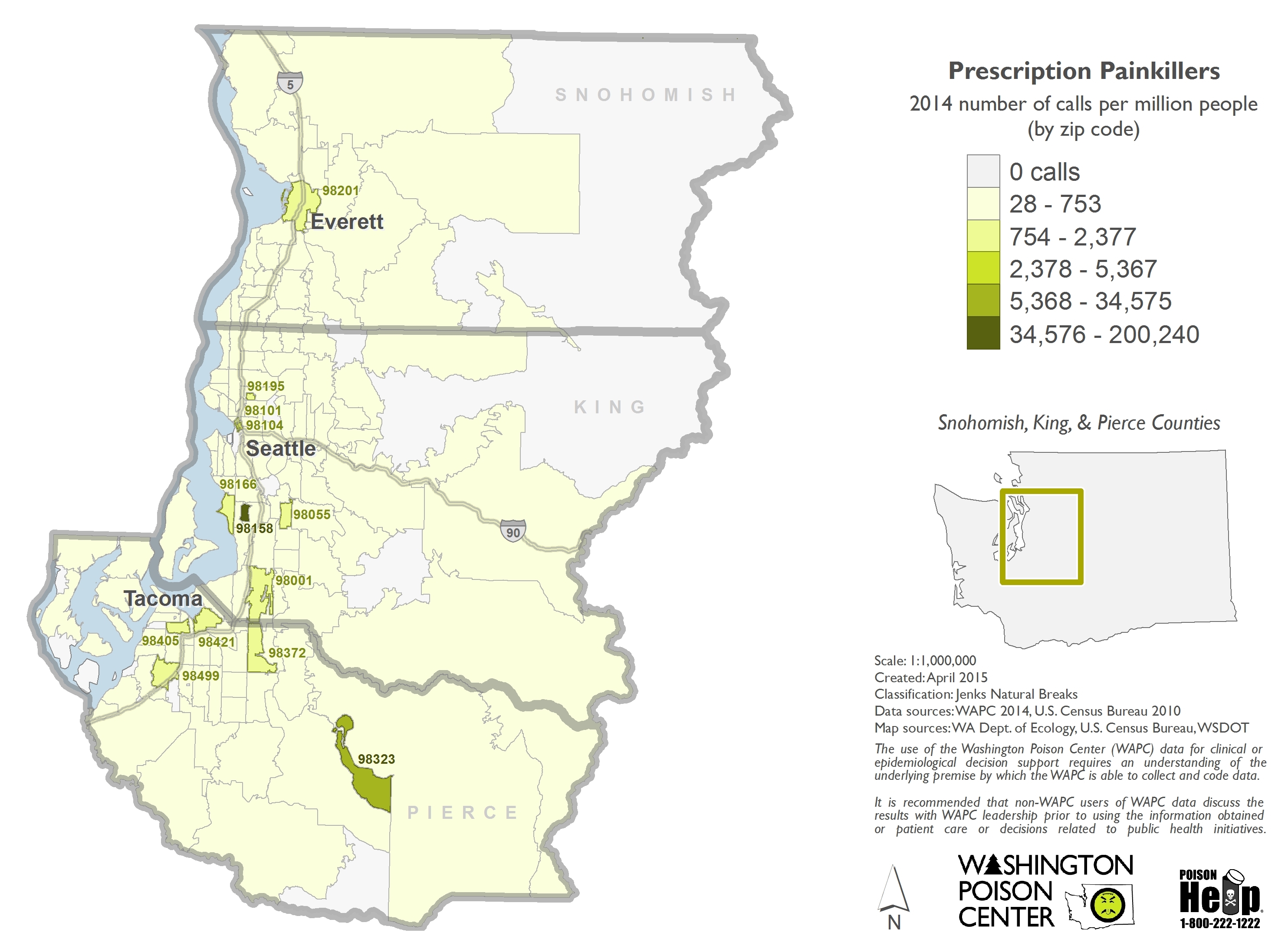
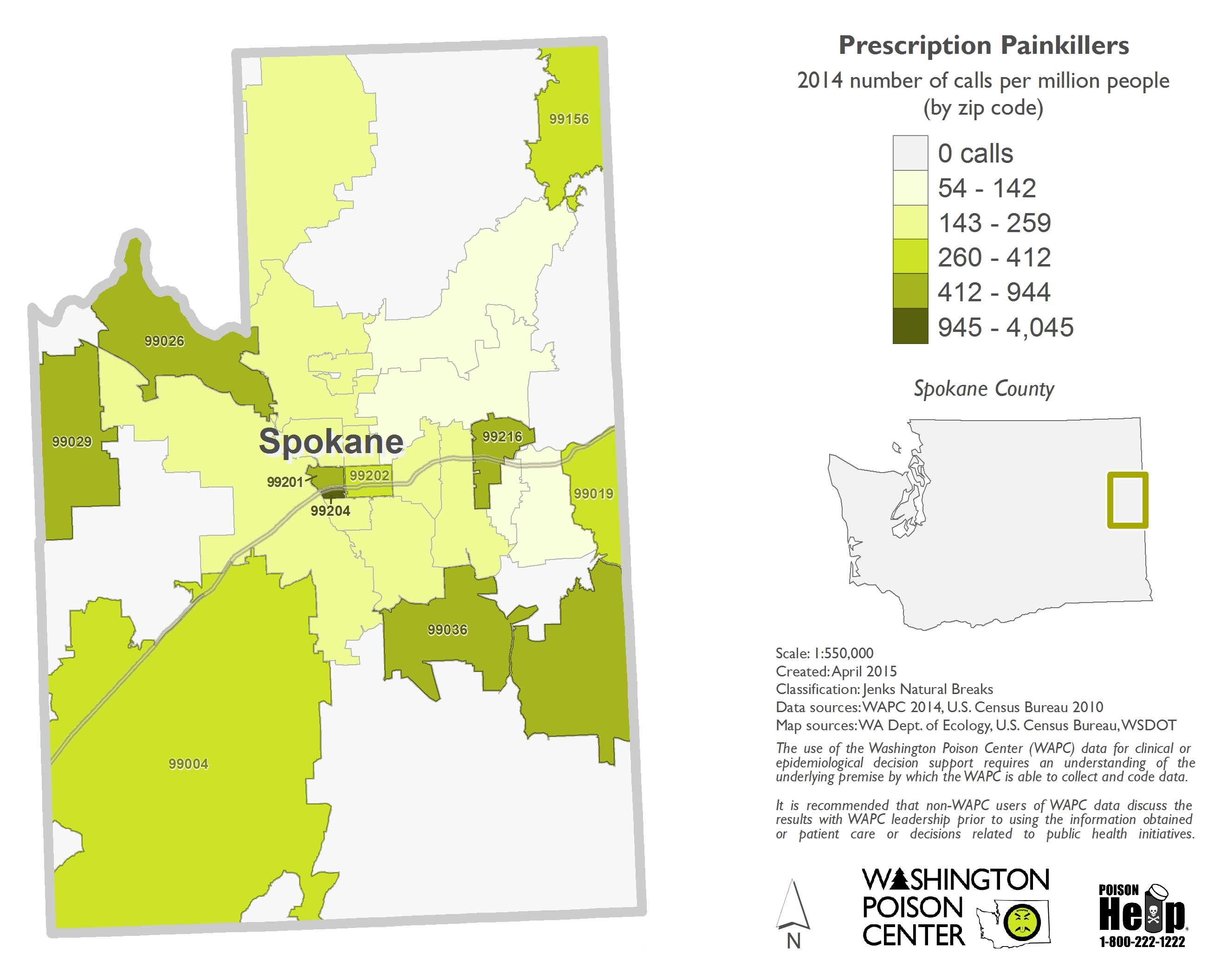
Static map examples:
![](https://www.mynameiskate.com/portfolio/wp-content/uploads/2017/07/ECig_2014_Cnty_All_per-million.jpg)
![](https://www.mynameiskate.com/portfolio/wp-content/uploads/2017/07/Opi_2012-2014_Cnty_All_totals-only.jpg)
![](https://www.mynameiskate.com/portfolio/wp-content/uploads/2017/07/Mari_2014_Leg_All-a.jpg)
![](https://www.mynameiskate.com/portfolio/wp-content/uploads/2017/07/Mari_2014_Leg_All-b.jpg)
![](https://www.mynameiskate.com/portfolio/wp-content/uploads/2017/07/Painkillers_2014_Zip_SnoKingPierce_per-million.jpg)
![](https://www.mynameiskate.com/portfolio/wp-content/uploads/2017/07/Painkillers_2014_Zip_Spokane_per-million-compared-to-spokane.jpg)
Dashboard:
![](https://www.mynameiskate.com/portfolio/wp-content/uploads/2017/07/dashboard-screenshot.jpg)
![](https://www.mynameiskate.com/portfolio/wp-content/uploads/2017/07/dashboard-in-action.jpg)