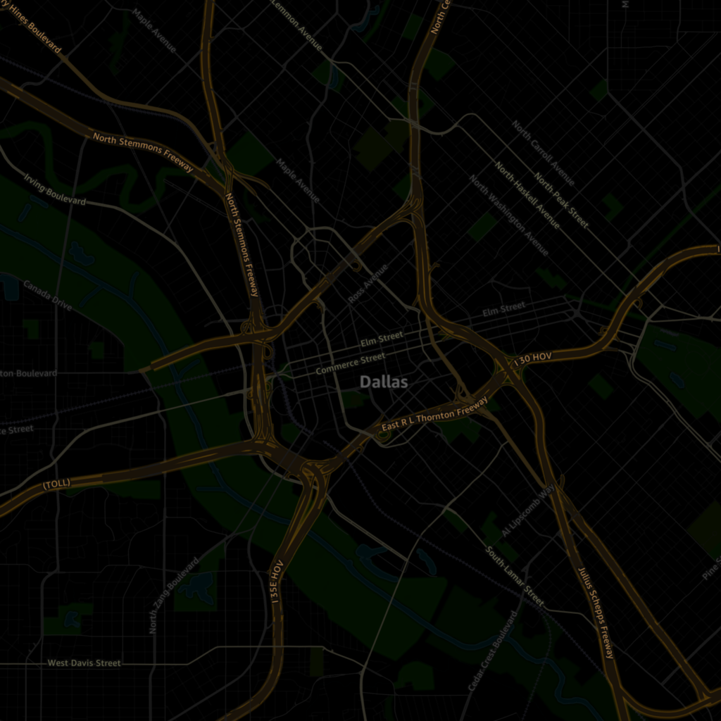
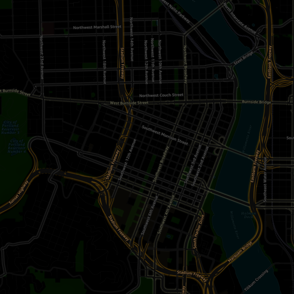
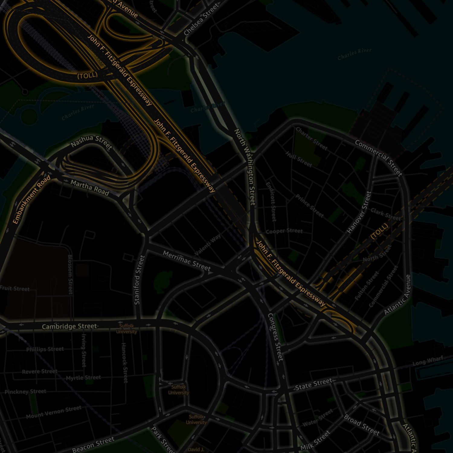
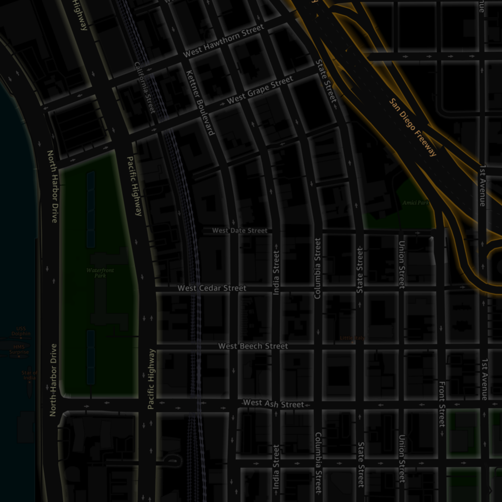
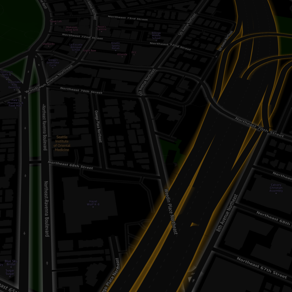
Driving at night with a bright map designed for daytime use is blinding and dangerous. On my own initiative, I did extensive research on human vision and color perception, and wrote a successful case for a project to develop a dark map.
I designed this map style while literally sitting in the dark, first in a cardboard “fort” I constructed around my cubicle, then in a blacked-out room in my house during the pandemic.
The innovative glowing design I created allowed me to use the same road colors as the light/daytime map while keeping the overall brightness to the appropriate level.
NOTE: unless you’re in a dark place, these maps will probably look too dark.