Where I Stand
By kate on March 15th, 2017
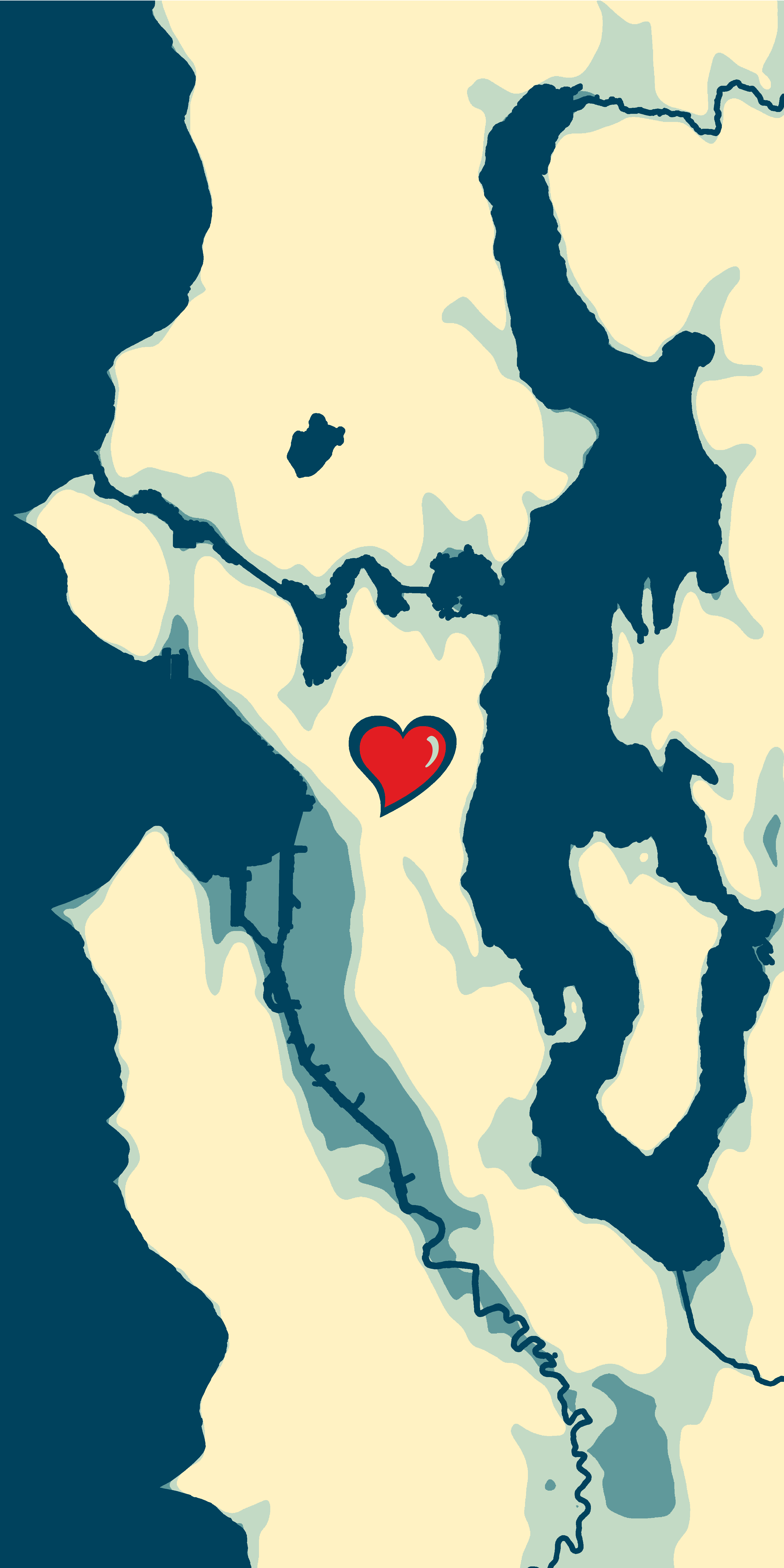
I’d like to announce a #resistance project I’ve been working on:
![]()
I’m raising money for vital non-profits by selling beautiful and striking map art decals for your phone. I created six designs, each inspired by a different cause that�s under attack right now. All proceeds from each design will go to a non-profit working for that cause. I’m supporting:
- reproductive rights (via Planned Parenthood)
- civil rights (via the ACLU)
- black lives matter (via Black Lives Matter)
- refugee resettlement (via�International Rescue Committee)
- investigative journalism (via ProPublica)
- environmental justice (via EarthJustice)

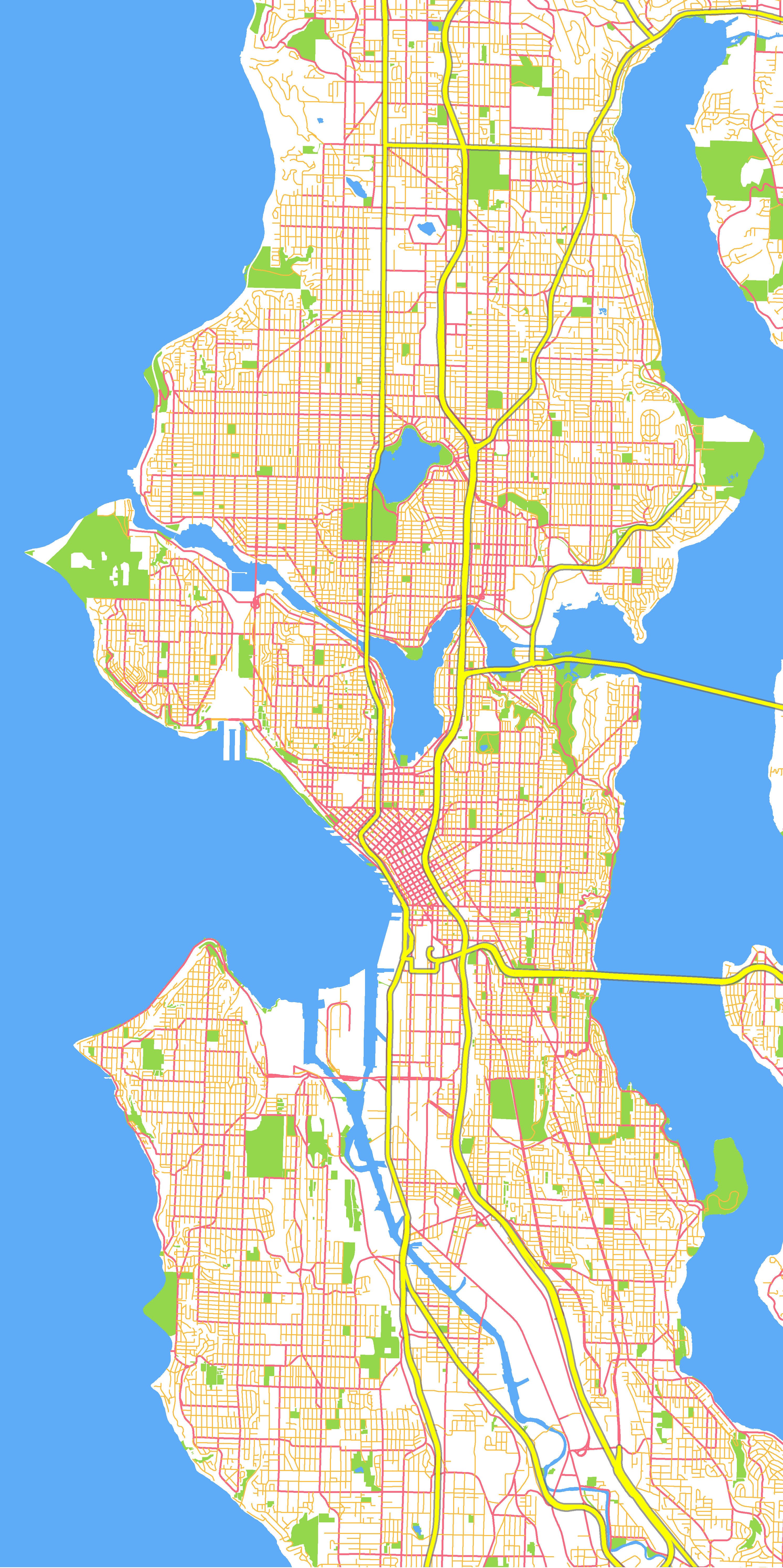
I selected non-profit organizations that are fighting on a national level, to have the greatest effect. All of them�have a rating higher than 90/100 on Charity Navigator, indicating low overhead, good financial management, and transparency (except Black Lives Matter, which doesn’t make enough income to be rated).
At least $5 from each decal will go to the designated cause, more if I can order in bulk or have a promo code. Right now the decals only feature Seattle and Puget Sound, and are only for cell phones. Let me know if you’d be interested in a laptop decal or another geographic area.
Buy one for yourself, and please spread the word! It’s going to take a lot of funds to keep up the good fight.
Filed under: current events, handiwork, justice, seattle | Comment now »
Make your firefly map REALLY glow
By kate on January 11th, 2017
This fall, I attended my second NACIS (North American Cartographic Information Society) conference, which has become a highlight of my year. One talk I found particularly inspiring was John Nelson‘s presentation on Firefly Cartography. I could explain what that means, but an image makes it pretty clear.
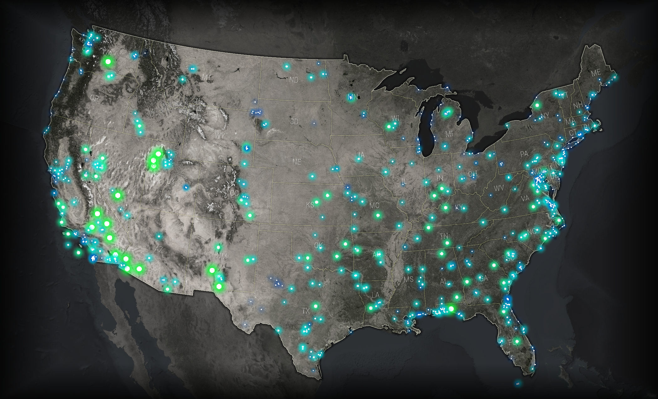
A firefly map of U.S. military bases, by John Nelson
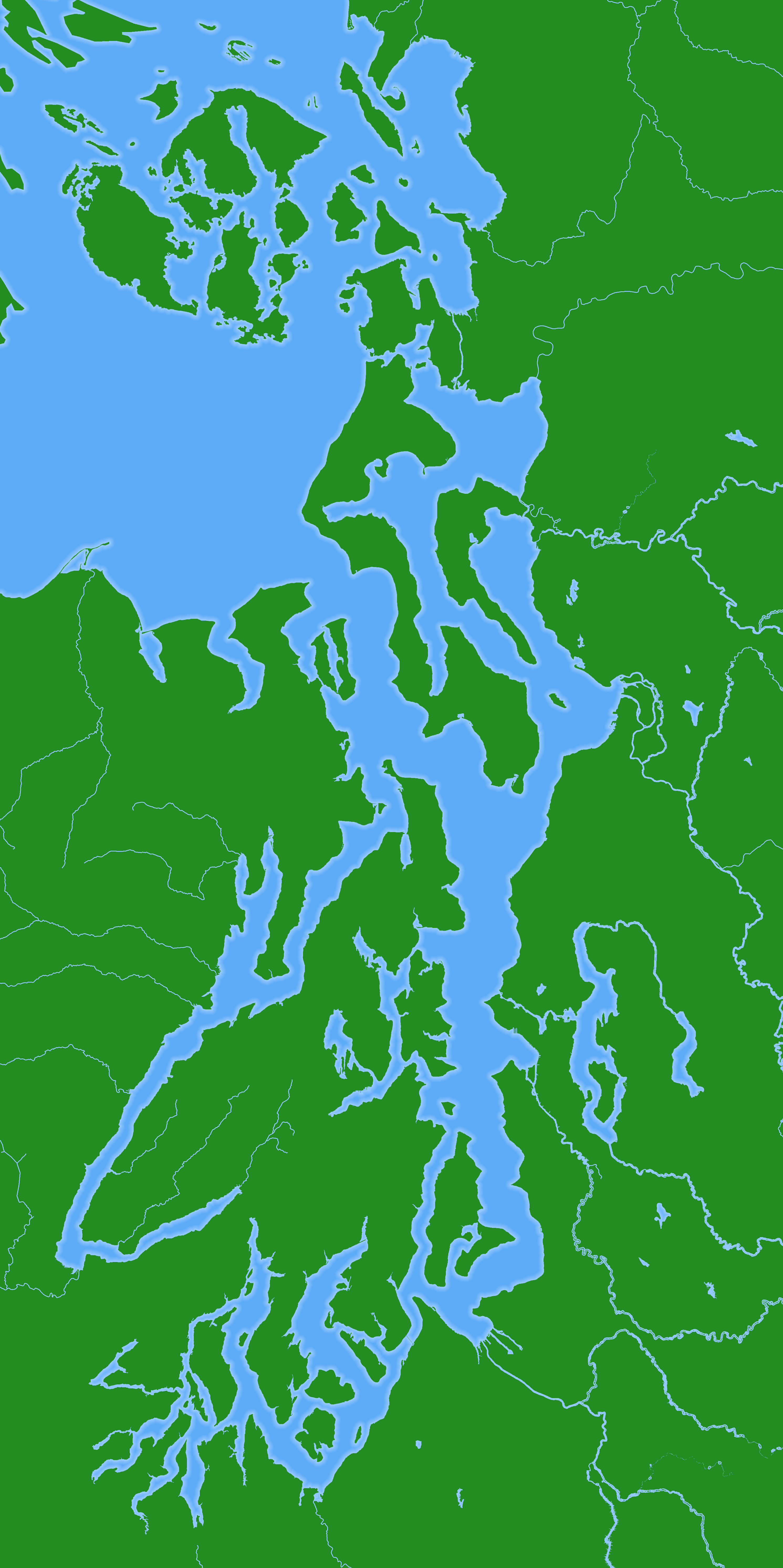
I was excited to make my own firefly map. At the same time, I was knee-deep in roads data for my employer, the City of Seattle, and had been wondering about the public staircases I noticed there. So I seized on that theme, and created this map in a few hours, using only ArcMap.
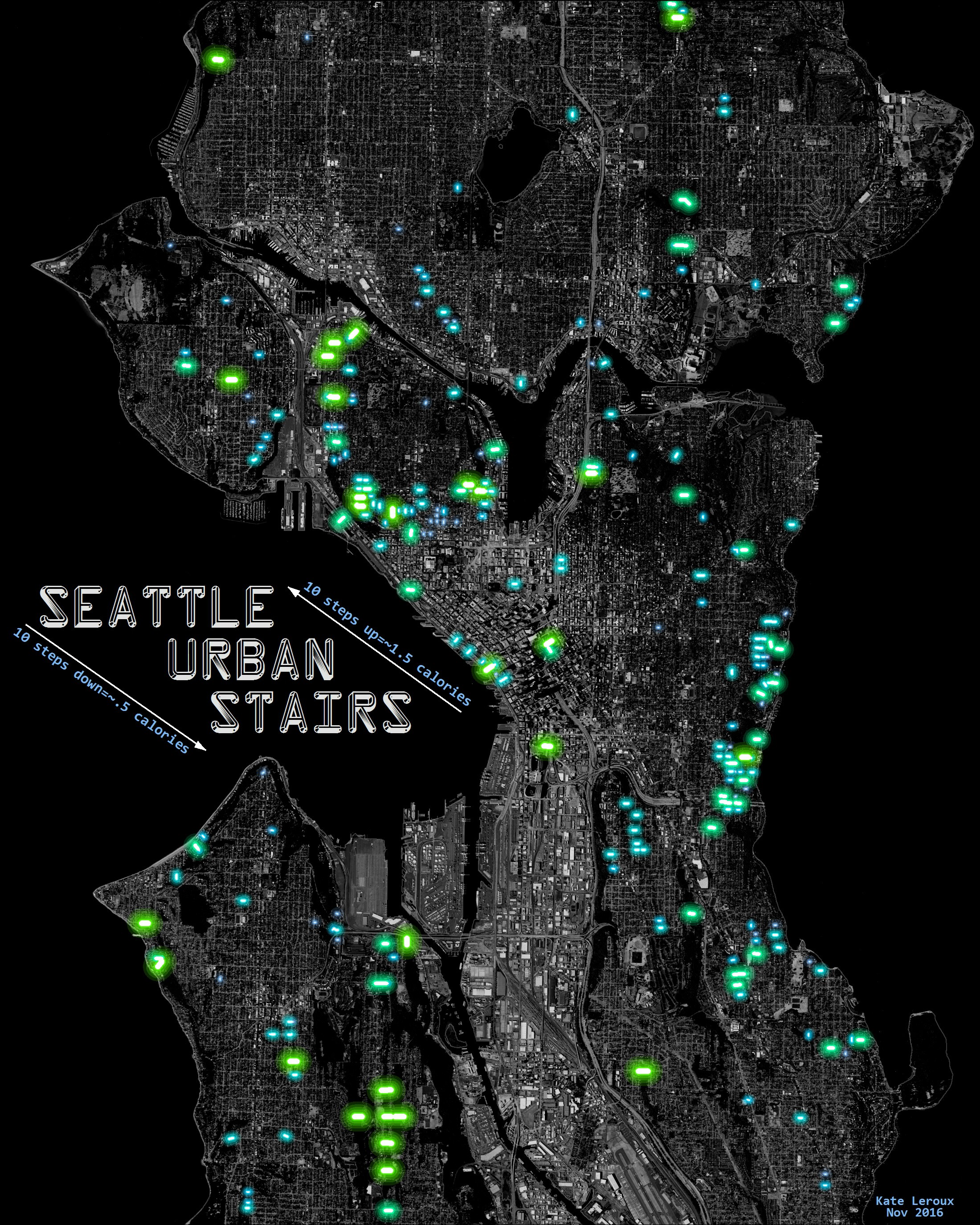
Click for full size
As John noted, glowing things have a white center surrounded by opaque color, then increasingly transparent color. I didn’t take the time to make perfect gradient icons in Illustrator; instead I just repeated the layer several times in ArcMap. The staircases are classified by length, so longer stairs are greener and brighter.
After I finished I was pleased with the look, but I wanted to take it a step further and make it really glow, not just look like it was glowing. So, I had it printed on glass!
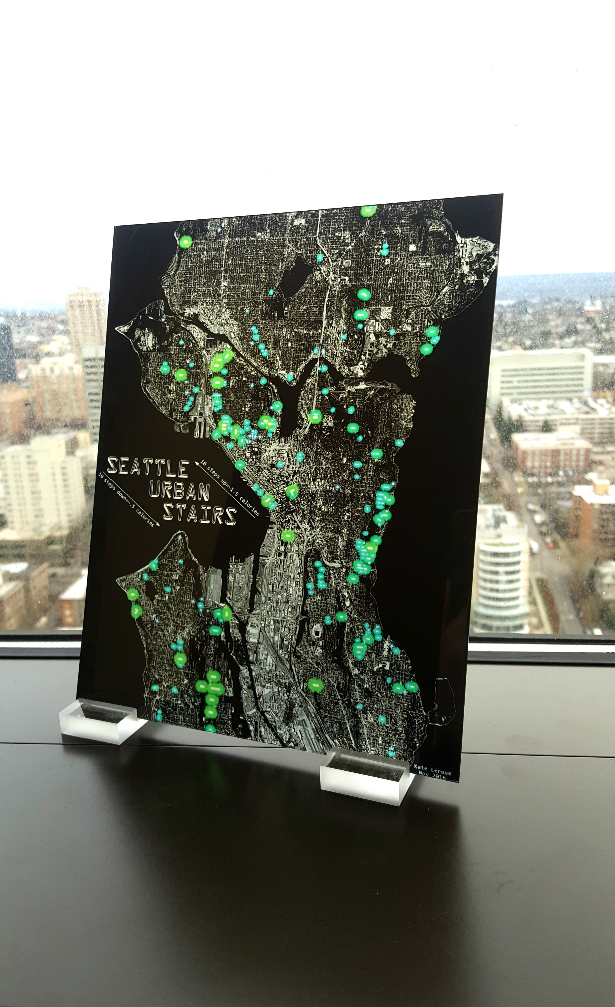
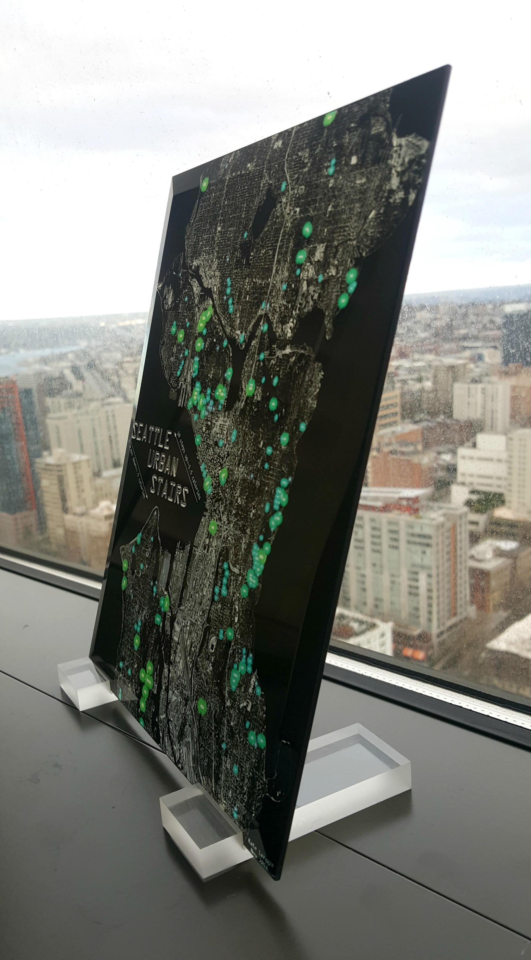
It’s easier than you might think – you can order glass prints from Shutterfly�(promo codes are usually available for a discount off the list price). Now my map truly glows.
Filed under: art, handiwork, seattle | 4 Comments »
Summer trip to Asia
By kate on June 1st, 2016
This summer, I’ll be traveling in Asia for three months with Grant and Ruby. We leave on Saturday! While we’re gone, we’ll be blogging at Traveling Ruby – go there to follow our adventures.

Click for larger version
Filed under: travel | Comment now »
Winning GIS Presentation
By kate on May 7th, 2015
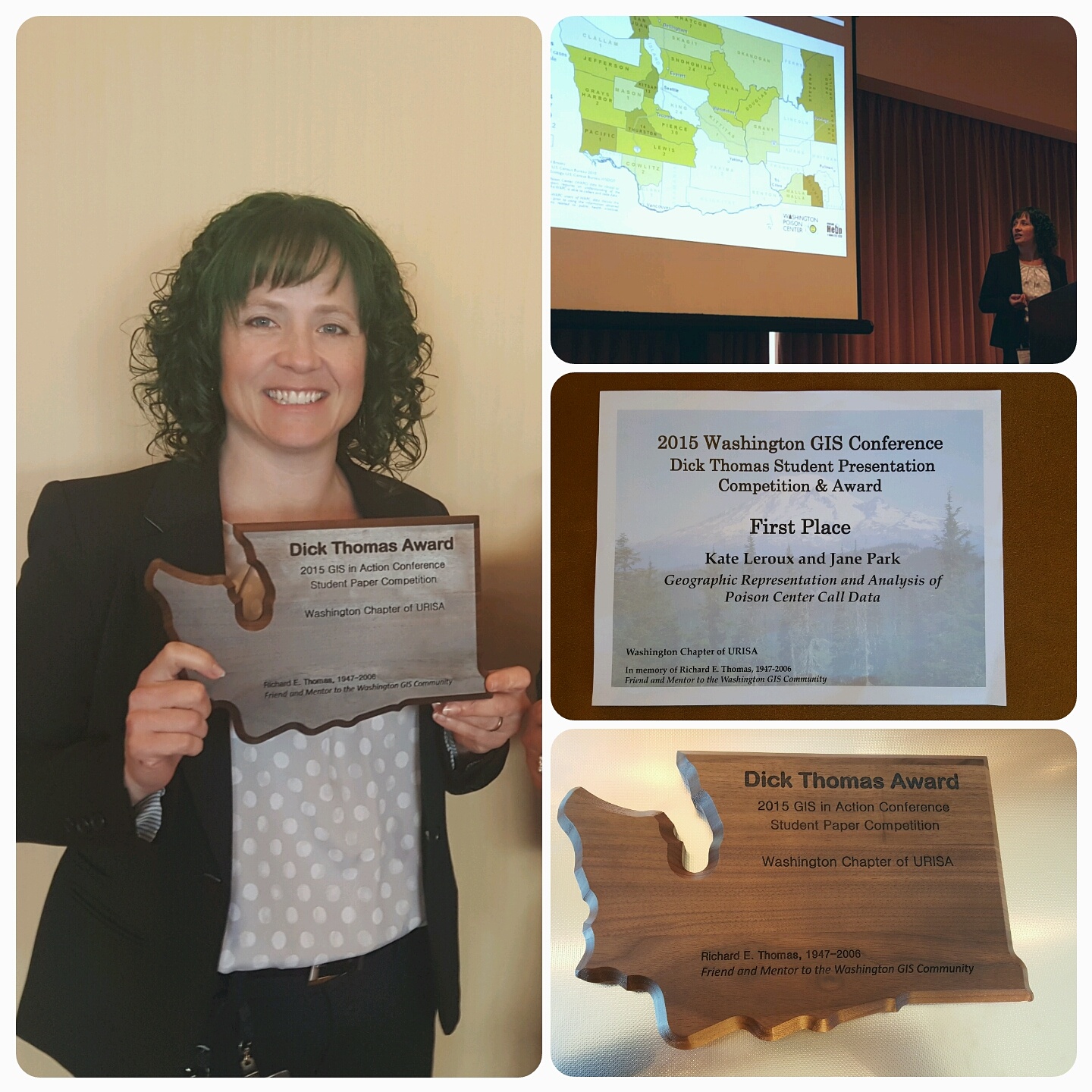 This week, I attended the GIS in Action conference and competed in the Dick Thomas Memorial Student Presentation Competition. I’m excited to say that my project won first place!
We presented the work we did for the Washington Poison Center: analyzing their call data, then creating static, animated, and interactive maps they can use for outreach and fundraising.
If you’re interested to see more, my slides are here and you can see some of my maps on my LinkedIn profile.
The complete 15-minute presentation is below. I recommend following along with the slides on your own, because the video cuts them off.
Filed under: handiwork, learning, technology, work | Comment now »
Learning How to Be Better at Sucking
By kate on February 26th, 2015
It’s fun to post about things I’m good at or know a lot about (like trapeze, where I’m working on the double – very exciting). I have a much, much harder time when people see me being bad at something. I get embarrassed, upset, and self conscious and just want to hide.
I’d like to be able to change this, especially now I can see that my daughter takes after me in this regard. I want her to learn as a kid that it’s OK to be bad at something for a while, to stick with it anyway, and enjoy�the fun of it. I was inspired by my friends Brian and Molly, who boldly started beginner piano lessons to demonstrate this to their kids.
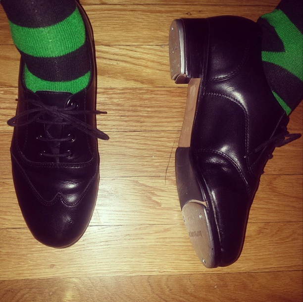 So, I signed up for a beginner tap dance class. I’ve always wanted to know how to tap dance, to be one of those people who can just whip out a little shuffle-step when needed. Finding perfect tap shoes at the thrift store followed by finding a class that actually fits my schedule prompted me to finally do it.
In a class of beginners, I’m the newest and the worst. The teacher is always giving me easier variations on the steps so I can keep up. And forget about operating my hands and feet at the same time – so far that’s impossible. By the end of every class I’m thoroughly demoralized and feel like a failure.
… which is what I am trying to practice. So I remind myself that it’s OK, it’s part of the point to feel this stuff. Then I try to talk about it in front of Ruby as much as I can. Last week I practiced in front of her too, working on a step until I got it down. In June, I’m facing the horror of an actual dance recital where my class performs a tap dance number on a theater stage in front of a large number of people who are only there to see their child perform (in a different song in the same show).
This is the hardest role model work I’ve done so far.
Filed under: active, body, learning, life, parenting | Comment now »
Sexist Ads for the Seattle Times
By kate on November 6th, 2014
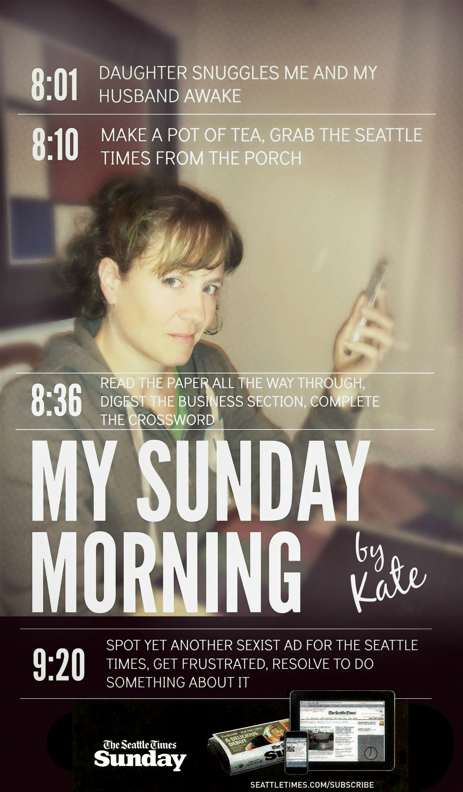
I’m a Seattle Times subscriber, because I like to read a local newspaper and it’s the only one left. They have their weaknesses and I don’t always agree with their editorial positions, but they still do strong investigative journalism. Recently, I started to notice a series of ads running in the Times advertising the Sunday edition of the paper. Each ad featured a “person” (I’m guessing they’re fictional) sharing their Sunday experience and how the Seattle Times is a central part of it. That’s a nice concept, but the execution started to annoy me as I realized each character was very stereotypical.
Wishing I would see some against-the-grain characters in this series of ads, I created my own. Below I’ve included five real ads from the Times so you can see for yourself how sexist they are.
-
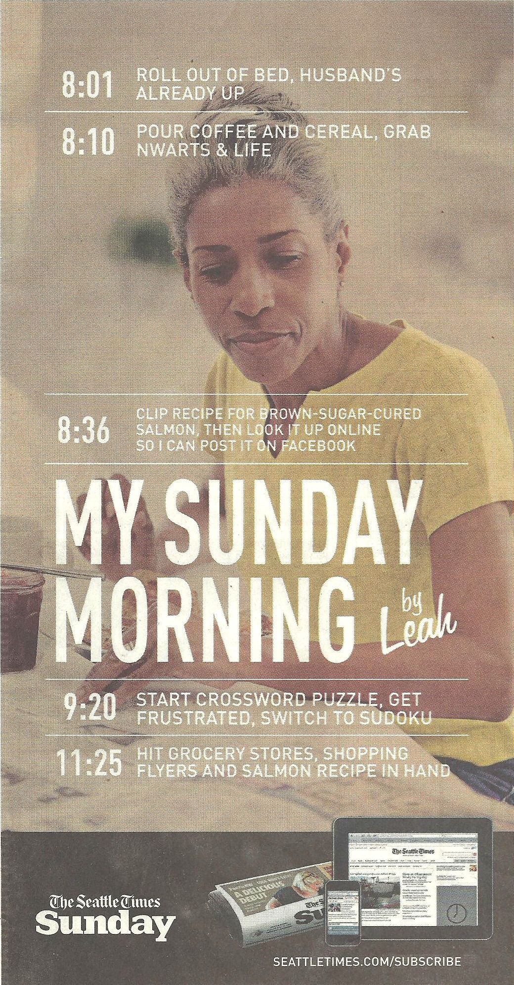
- In which we learn that women only read the entertainment section, cook and shop, and find crossword puzzles too frustrating
-
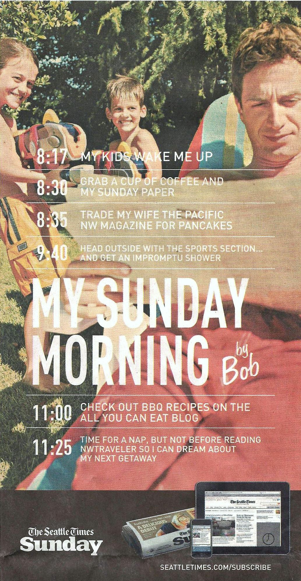
- In which we learn that women cook and prefer the magazine section, while men only read the sports section and occasionally think about cooking manly stuff like BBQ
-
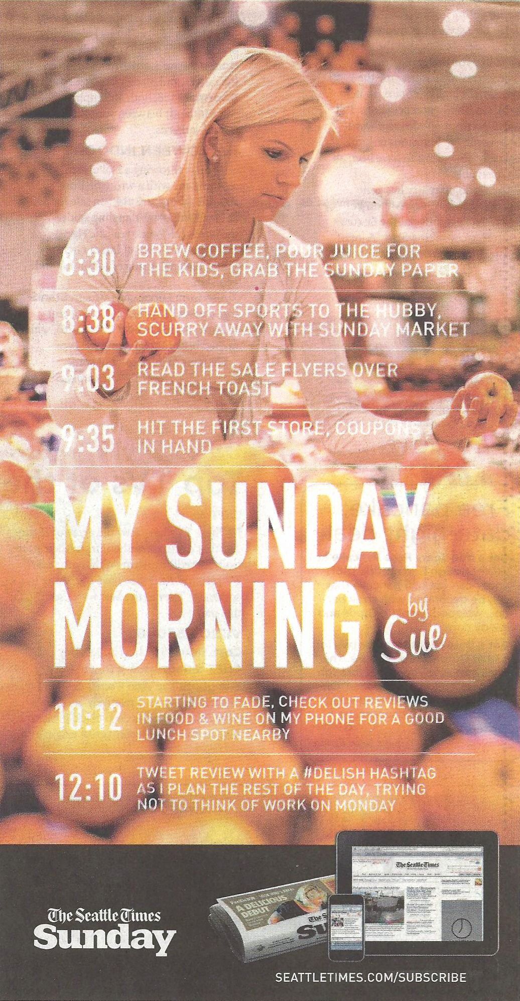
- In which we learn again that men only read the sports section and women really like shopping and reading about shopping
-
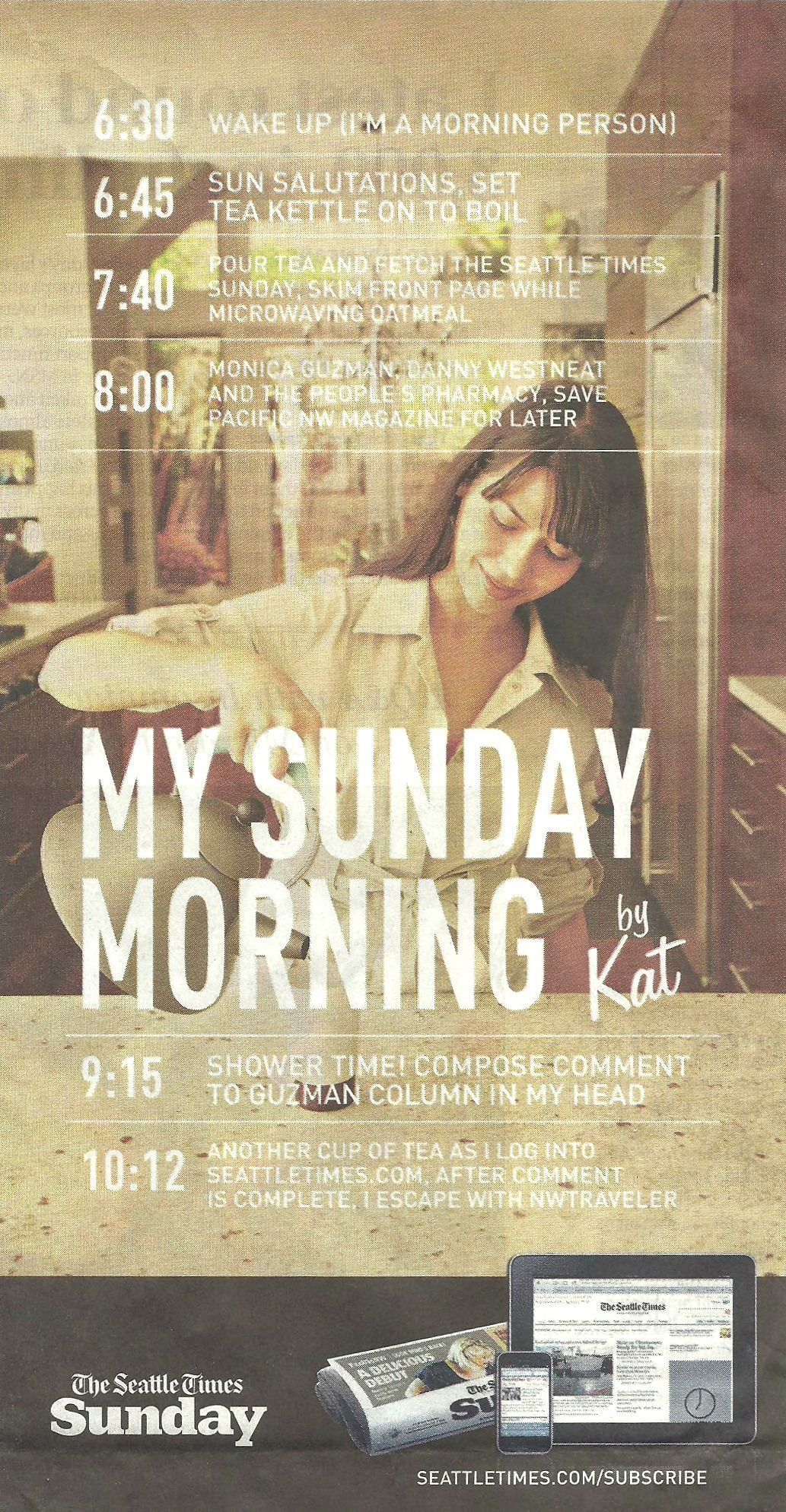
- In which we learn that women only skim the real news and much prefer opinion columns and the magazine section
-
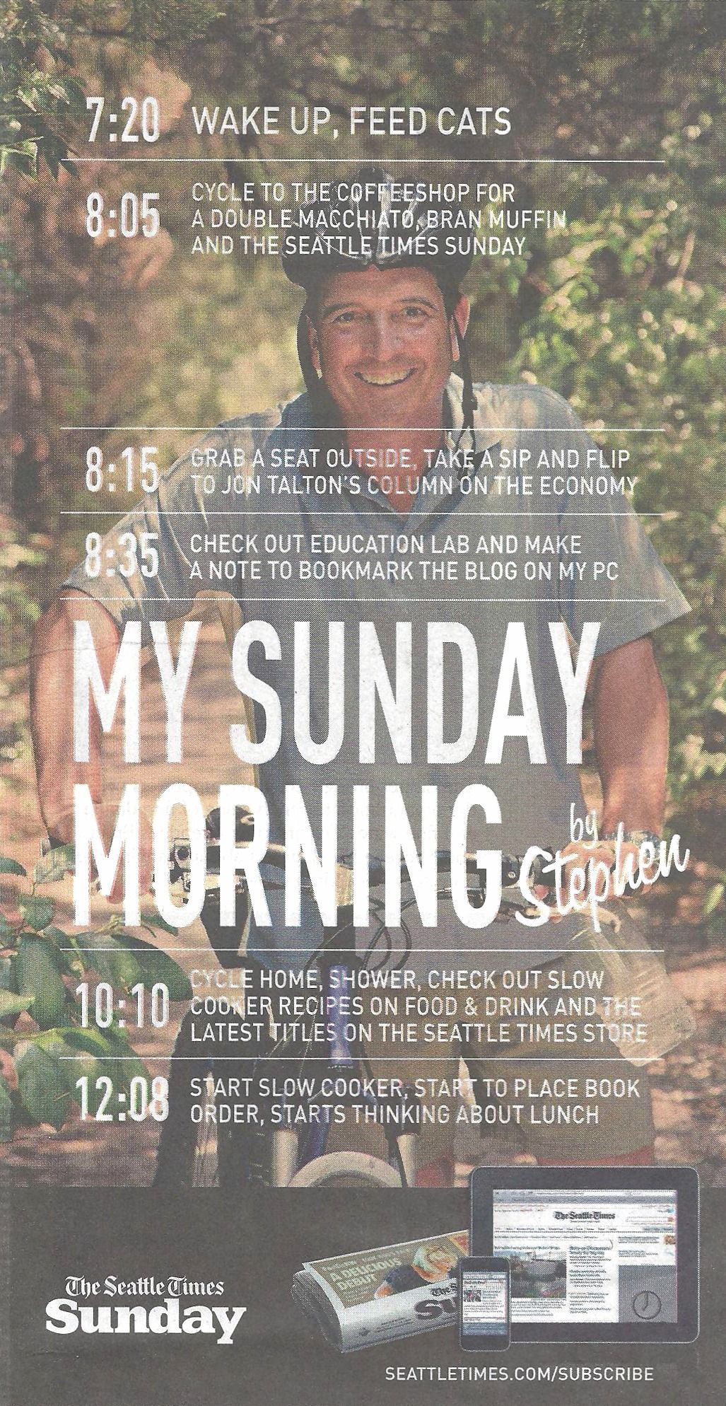
- This one’s OK, actually – a well-rounded guy
Filed under: consumerism, current events, handiwork, media | Comment now »
| « Previous Page | Next Page » |


Contact
Recently Read